Conference as User Experience: Evaluating Confab through the UX Honeycomb

When we talk about user experience (UX), conferences don’t always make into the conversation — at least not as much as websites, mobile applications, or even printed materials. And yet, conferences are the ultimate user experience. They are a coming together of place, sense, technology, action, and information, backed by a defined purpose. A good experience means return attendees. With this in mind, UX should play a major role.
Everyone’s been to a bad conference, or at least a poorly-planned event. You’ve probably eaten a sad sandwich, been on a lackluster panel, or dealt with unprofessional attendees. Luckily, nothing could be further from the case at Confab, a content strategy convention based out of Minneapolis that I had the pleasure to attend earlier this year. I’ve worked in tech for over a decade, have been to more than a few conferences, and can honestly say it is the best conference I’ve ever attended.
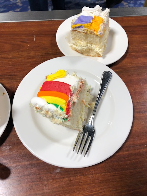
As I attended relevant sessions, made new friends, and enjoyed the shockingly solid food options, I kept thinking — what was making this such a good user experience? Reviewing Confab through Peter Morville’s User Experience Honeycomb, I’ve worked to identify the components that made it an informative, cohesive, and enjoyable experience as a content strategist, a person who attends conferences, and a human. The answer is cake (they end the conference with a giant cake). Pastries aside, there was also a lot more that made this conference an excellent user experience.
Photo: Author
A Brief Recap of Peter Morville’s User Experience Honeycomb
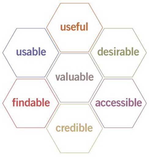
Before we dive in, let’s go over a brief recap of Peter Morville’s User Experience Honeycomb:
- Useful: Your content should be original and fulfill a need
- Usable: Site must be easy to use
- Desirable: Image, identity, brand, and other design elements are used to evoke emotion and appreciation
- Findable: Content needs to be navigable and locatable onsite and offsite
- Accessible: Content needs to be accessible to people with disabilities
- Credible: Users must trust and believe what you tell them
Source: https://www.usability.gov/what-and-why/user-experience.html
All the Information, Right Up Front (Findable)
Findable: Content needs to be navigable and locatable onsite and offsite
I found out about Confab through Brain Traffic, the content strategy agency that organizes the event, but if you type “content strategy conference” into Google, Confab is the first result. Confab uses SEO to ensure that anyone can find out about the conference, even if they’re not tapped into a network of UX professionals or active on social media.
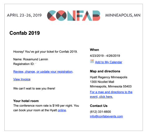
Beyond becoming aware of the conference itself, I was able to quickly find out more about it through email, website, and eventually via the conference’s Slack channel. I received my first email right after I registered — it contained all the baseline information necessary to attend, without any clutter:
In the months leading up to the conference, I received several emails with time-appropriate information, including:
- Lightning Talks: An invitation to speak onstage, received just after registration
- Connecting at Confab: How to communicate with people throughout the conference and share information, as well as networking events, received about a week before the conference
- Confab 2019: Everything you need to know as an attendee; official all-purpose email, received the weekend before the conference
There were other emails, but I didn’t get a chance to read all of them — and it never mattered. Nothing was tucked away in the 20th line of text or an obscure website. Throughout the conference, all necessary information was always available through four main avenues: the website, conference Slack, physical displays, and conference organizers.
Confab’s communication timeline underscored the importance of time, place, and format for messaging. They didn’t start with an avalanche or a slow trickle, instead, they gave me enough information to feel prepared upfront, with an opportunity to dig in more if needed.
During the conference, there were many ways to get my questions answered, but I didn’t feel bombarded. Putting the big, necessary information upfront, and giving you the tools to figure out the rest, AKA prioritizing content, helps make an experience approachable, but not oversimplified. After the first day (honestly, the first hour), I barely had any questions, which freed up brain space to follow along with the sessions.
A Deeper Dive Into A Growing Field (Useful)
Useful: Your content should be original and fulfill a need
UX is a young discipline, content strategy is younger still, and due to the nature of tech work, many of us are scattered around the country and the world. Sharing information and exploring different facets of our practice is still new territory (or at least lightly trod) for many who work with content. It was incredibly helpful to know what other people in my field were doing: what they’ve figured out, how they did it, and what it meant for their organizations. The panelists spanned many areas of expertise, from marketing to analytics to user experience, and the topics they covered were a good blend of research-backed best practices and emerging concepts. In the sessions I attended, we covered everything from writing for the web to centering marginalized voices to content audits to chatbots.
Marchaé Grair speaking on centering the margins in digital spaces / Credit: Confab Events / Sean Tubridy
Exploring these ideas with peers and experts provided not only consolidated, coherent information, but an environment where we could discuss, learn, and grow. Although Morville states that content should be “original,” what I took away was how useful it is to shine a new light on old ideas, and create a forum for these findings.
Information is a very old concept — viewing it from a variety of lenses (technical, cultural, practical) and sharing the results of that exploration can answer a variety of questions, and even introduce people to answers they didn’t know they needed. Confab focuses on content strategy, but the idea of many lights on a single practice can be applied in many ways.
Dan Brown speaking on IA lenses for content strategists / Credit: Confab Events / Sean Tubridy
Modern, Friendly Appeal Balances Content And Design (Desirable)
Desirable: Image, identity, brand, and other design elements are used to evoke emotion and appreciation
Confab’s branding and presentation does a nice job of appealing directly to a specific audience, but remains broad and friendly enough to encompass more casually involved groups. Confab literally means “conference” — using the word positions them as clever, but also friendly and modern (fab!). Beyond naming conventions, the art deco style logo looks clean and classic, but also colorful and almost screen-printed, conveying the idea that this is a professional event, but a fun one. This is echoed in the voice and tone used throughout the website: clear, concise, helpful, and nice. Logo colors are pulled out into sub-pages as well, creating an overall cohesive feel.
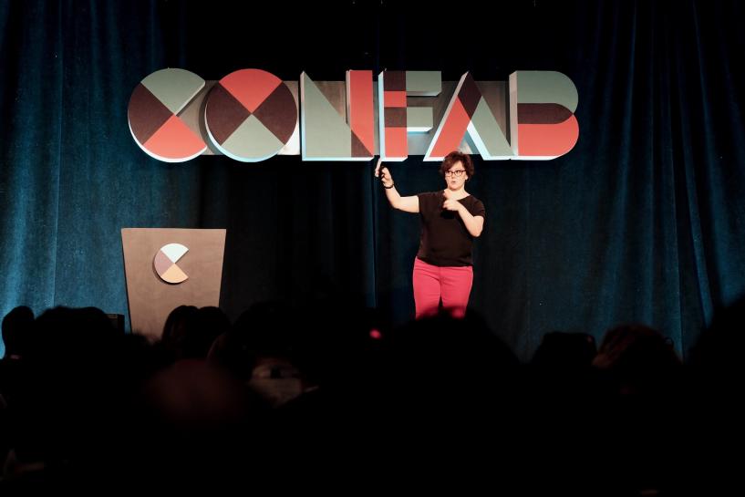
Kristina Halvorson welcoming attendees to Confab / Credit: Confab Events / Sean Tubridy
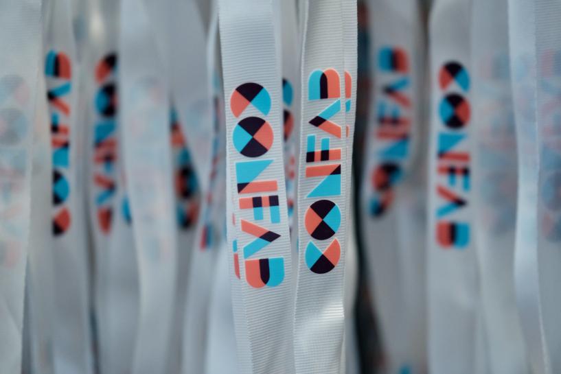
Lanyards hanging on a lanyard tree / Credit: Confab Events / Sean Tubridy
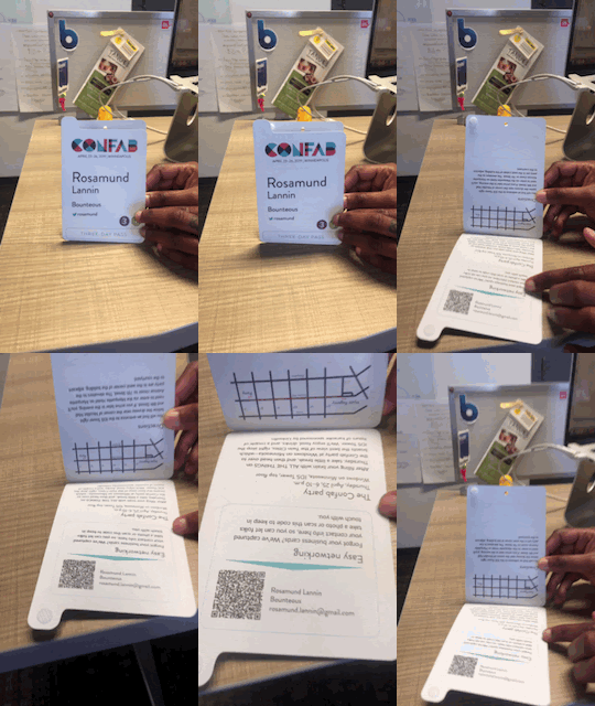
The physical conference didn’t overwhelm with branding for the sake of seeing its own name and colors — rather, it was woven in at appropriate moments and used as a grounding or informative presence. There were physical signs letting you know a) you were at Confab and b) where you should be next. Even the badges blended information and personality in a seamless way, with a pre-configured QR code that let you add people as contacts, replacing the need for a business card. Confab recognized a common conference interaction (connecting with other people), and solved it in a way that felt right, looked nice, and made sense.
Badge with QR code, making conference interactions 30 percent less awkward, with an assist by cube neighbor / UX Designer Krystal Flowers. / Gif: Author
It’s a blurry photo, but please note that this badge features my name, company, Twitter handle, the workshops I’m attending, and my type of pass. But wait, there’s more!
A Website That Keeps It Simple, Not Stupid (Usable)
Usable: Your site must be easy to use
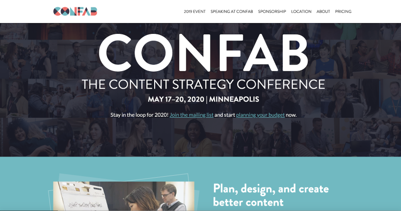
There were many ways to stay informed throughout the conference: physical signage, helpful volunteers, and the conference Slack. But the website was the main hub — a streamlined digital space with key information and several main paths made clear on the homepage including the conference schedule, speakers, and locations (information about Minneapolis).
Next steps were available in 1-2 clicks. The website’s content shifted slightly in a way that aligned with timing — pre-conference, registration info was surfaced higher up, while the post-conference state showed the date of the next conference, as well as a recap of 2019. This lightly personalized approach appeared to target broad audiences — attendees and organizers and participants (sponsors, volunteers, speakers, etc.).
How and where information was displayed echoed where these groups would be in the conference timeline. By aligning with the user journey, Confab created an experience that met the needs of different audiences at every point in the process.
A more straightforward thing I really appreciated was the documentation — all of the conference presentations were available on the website, and in many cases video was available as well. This provided an easy reference point and way to share my learnings.
Beyond content, the information architecture (IA) and visual design were clean and straightforward, playing a strong supporting role to the information. Fresh, appealing, and easy to navigate, the website was easy on the eyes, without distracting from the main point with visual pyrotechnics or heavy-handed branding.
My only critique was that I wanted to see what workshops I had signed up for, possibly through an easily accessible authenticated state. To find that information, I had to go back through my email or log into a different website.
Lastly, I want to nod to how usable they made the physical site. Things like having meals that fit a variety of dietary needs, extension cords in every conference room, a quiet room for chilling out, and a loud room for making calls ensured attendees could be alert, connected, and present. Making a physically comfortable space means people don’t have to spend time ensuring their needs are met, and gives them the opportunity to get the most out of their experience.
Developing Inclusivity, Online, and Offline (Accessible)
Accessible: Content needs to be accessible to people with disabilities
Confab’s website scores highly by WCAG standards, and their commitment extends beyond the digital. In addition to creating an accessible website, Confab brought the concept to the tangible experience as well. Per Tenessa Gemelke, Confab’s Director of Education and Events:
"We featured knowledge about accessibility on our main stage, rather than making it a breakout session. Specifically, we invited Sarah Richards to explain how accessibility ultimately improves most usability issues online.
We included captions for all main-stage talks and transcriptions for all archived videos. We noticed some issues with the captioning, so we may be seeking a new captioner for 2020.
We planned for flexible seating options. We offered both sitting and standing tables as well as theater-style seating with the chairs spaced more loosely than the hotel initially recommended. We included a note in our attendee info inviting folks to contact us if they needed any specific kind of seating. We were prepared to rearrange and reserve space as needed.
We chose an accessible off-site venue for the party. Hotels are nearly always wheelchair accessible, but some party venues only have stairs.
We offered the Confab Equity Scholarship to remove barriers to attendance. We try not to look at accessibility only as a list of checkboxes for legal or prescribed actions, but as an ongoing issue of inclusivity. We recruited a diverse advisory board, including someone with a disability, to be sure to screen applicants as fairly as possible."
Peers And Authorities Come Together (Credible)
Credible: Users must trust and believe what you tell them
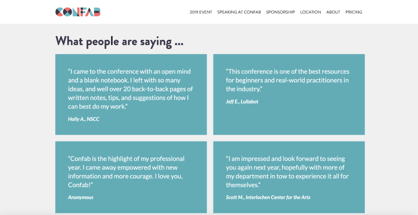
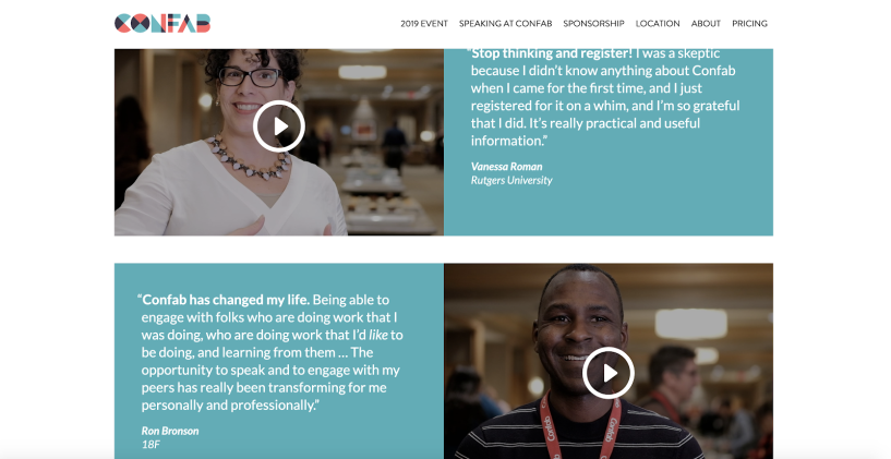
Confab leveraged social proof from the get-go — testimonials sit front and center on Confab’s homepage, and also have their own section. In the Testimonials section, there are videos of attendees describing their positive experience with the conference. Their backgrounds span industries and roles within the practice, which gave me a sense that not only is this a good conference, it’s a good conference for many different types of people.
The website also provides bios for the speakers and some of the organizers, as well as a history of the conference. It was very clear who was doing what, why they had been chosen, and how you could find out more. This information was also repeated via email.
At the conference, questions were quickly answered by volunteers — if they didn’t know the answer, they were honest about that and quick to find someone who did.
Between website, communications, and in-person interactions, a wealth of useful information was offered immediately. This transparency, combined with positive feedback from real people, made me immediately comfortable and increased my level of engagement throughout the experience.
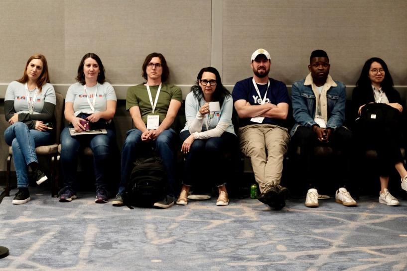
Confab’s valiant volunteer force / Credit: Confab Events / Sean Tubridy
Focus on User Experience
A strong focus on user experience made Confab a great conference on many levels. Although it was clearly engineered with people in mind, and maintained a spirit of humor and openness, this did not take away from the intellectual focus, relevant information, and serious topics that are part of content strategy. Rather, creating a digital and physical environment that puts people first gave big ideas and relationships room to grow.
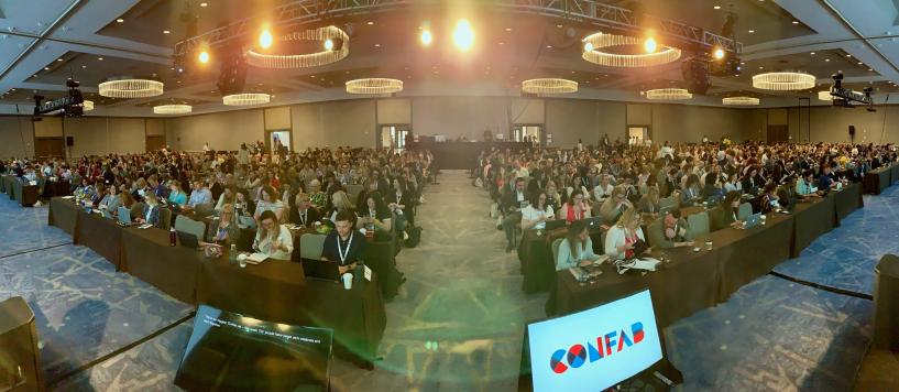
The Confab crowd / Credit: Confab Events / Sean Tubridy
