Reading Reports In Google Analytics: Loyalty
I really, really had no idea how to read the GA Loyalty report.
So, once again, I did some testing (including just myself in a profile) and learned, this time, how Loyalty works. (Want to learn how to read the recency chart? I wrote about that one last week.) I learned a few important issues wrt Loyalty:
Like the Recency Chart, Loyalty is about visits, not unique visitors.
Grab your calculator again, and add up all the visits in the loyalty chart; you will see that they match the number of visits in Visitors > Visitor trending > Visits. For every visit in the period, there is a visit on the chart.
The Loyalty chart will measure the visitor’s visits as far back as there are cookies on the visitor’s browser.
It doesn’t matter that old visits are outside of the period. This one is hard to understand immediately, so I will show you a picture. Those of you who read my post on understanding the Recency chart know that I had 16 visits between November 13 and November 22, and I was the only visitor in the profile (and if you didn’t read the post, you can glance at the chart really quickly.) I didn’t clear my cookies before creating this new profile, and of course, I was the only person in the profile. Imagine my surprise when I looked at the loyalty for that period:

In retrospect, this makes perfect sense. I did this analysis on the LunaMetrics site, and I visit it all the time, especially when I am blogging. So I had cookies on my computer that showed the hundreds of times I had been there, and GA put all of my visits into the top category, 201+.
GA does not aggregate an individual visitor’s visits.
This might seem counterintuitive. After all, we just looked at my sixteen visits getting aggregated into the 201+ category, right?
Well, that is an illusion. For each visit, GA computes how many times the visitor has already been to the site. I have been to the LunaMetrics site many hundreds of times, so these might be visits 3001,3002,3003… etc. But the top category is 201+, and that’s the only place GA can put them.
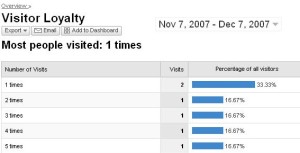
So let’s look at an experiment where I did clear my cookies first. Here, I had six visits between my start date, 11/18 and 12/4:

Eye opening, isn’t it? Notice that every time I visit, the Loyalty chart puts my visit into a new “bucket.” (There are two visits with a loyalty of 1 time, because GA thinks that I am two different visitors and doesn’t know how to show that I visited six times. The visitor dashboard even says: six visits, two unique visitors. Web analytics are not perfect. Sorry.)
The Loyalty Chart is quite useful.
Unlike Recency (which you can make a little useful, but is still a really, really hard chart to work with), Loyalty is really meaningful. If you are an e-commerce site with a ton of one-time visits (which is what I see a lot), then you need to look at your e-commerce menu and see if your “visits to purchase” number is very high. If it is, congratulations – maybe they come only once, but they buy. On the other hand, if your visits-to-purchase is low, and you have a *lot* of one-time visits, you need to start digging deeper.
And if you are a content site, like Facebook, oh wow! A high number of one-time visits really does show low engagement with the site (or maybe it’s about growth – you’ve got all sorts of new members, but you’ll know that from your back end.) Facebook and their sisters should be looking for a graph with lots of those 100-249 and 201+ visits.
Note: GA has updated their “about this report” descriptions (found in the lower left of every report). Go check that out, and congratulations, GA, on a great usability fix.
In closing, let me just get down on my knees and beg the Google Analytics Product Manager to rename this chart: Can’t we call it “Frequency”?


