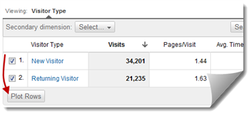
Plot Rows In Google Analytics
Why do people love graphs? It’s simple, really. There is no better way to represent the interactions between multiple quantities. A graph tells us how a variable changes in relation to another variable, and it does it in a clear, easy-to-interpret fashion. This is a hell of a lot easier to read–and a hell of a lot more fun–than a table full of numbers.
Trending is Key
When you chart a variable against time, it’s easy to see trends. Pinpointing a big change is as simple as following the lines. If you use Google Analytics, you’re used to these time series charts. There’s almost always one at the top of the page, showing you a metric graphed against your date selection.
In the current Google Analytics, there’s only one way to really get context on your charts. You can use Advanced Segments, which will display multiple lines for each segment on your timeline:

Thankfully, there’s an easier and faster way to throw multiple rows of data onto that chart. With the new version of Google Analytics, the Plot Rows feature lets you graph any two rows from the data table below. So in addition to the overview line, you can have up to two additional sets of variables displayed on the timeline.
Plot Rows in Three Clicks

If you want to quickly compare New vs. Returning visitors, as in our example above, you can go to the New vs Returning report and click over to the Data view (Plot Rows only works in this view and won’t show up in Percentage or Performance or any of the others). Now just click the checkboxes next to the lines that you want to compare and click the Plot Rows button.
You should see a timeline that looks something like this:

Same results as before, but we got there much easier. No need to click or set up Advanced Segments. It’s right there on the data table.
Don’t Fail with Scale
Now, there are some drawbacks to line charts. If you’re not careful, the scale of the chart can hinder any potential analysis. Take a look at the following:

It’d be great if you could disable the blue line (which represents the total or the overview numbers), but for the time being, you can’t. Until then, the Plot Rows function will be more useful if you keep scale in consideration. If all else fails, you can always look at percentage metrics like bounce rate or conversion rate:

Ahh, yes. Now we’re getting somewhere. Combine this sort of timeline with a healthy dose of annotations and you’re on your way to some keen analysis.


