Navigating The Settings In The New GA Interface ‑ We're Not In Kansas Anymore

I’ve been meaning to write this post for several months, as I’ve repeatedly fielded questions (and complaints) about how to find things “behind the scenes” in the administrative settings of the new Google Analytics interface. Now that the “new” new interface has finally been released, it’s time to highlight the major landmarks. Once you know what to look for, it will make a lot of sense. And managing your accounts and profiles will be faster and easier than ever.
Where Did My Reports Go?
The first thing you may notice about the new interface when you log in to Google Analytics is the big empty orange bar. Where is everything? This is the new “Account Home” – what used to be the overview of all your accounts. There are no numbers here for comparison (sad), just an alphabetized list of accounts and profiles. And where are the reports?

Usually instead of heading for the administrative settings first you’ll want to go straight to a report. So let’s take a quick detour through the up-front navigation and then I’ll take you behind the scenes.
Searching and Clean Profile Switching
To get to a report you have to choose a profile. You could scroll through the list, expanding the plus signs, but… don’t. (Unless it’s a really short list.) The fastest way is to start typing in the Search box either the name of the profile or the account it’s under. Then click on the profile you want and the Visitors Overview report will appear.
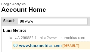
You can use the same type-to-search method to switch profiles from any report, only this time you type in the Accounts List under the arrow at the upper left. By the way, if you want to see the name of the profile you’ve currently selected, you have to hover over the web property name in the orange bar (again, sad – wish they’d display the profile name instead).
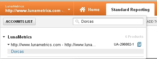
On the other hand (not sad!) when you switch profiles, GA will remember the way you’ve configured the report – such as changing the date range, the view, or the filter – and show you the same report in the new profile. For me, this clean profile switching is one of the best features of the new interface.
Now we’re ready to go behind the scenes and figure out what’s what in the new administrative settings.


Meet the Web Property – A Group of Profiles
When you click the gear icon at the top right of GA, your first thought might be, “Where the heck am I?” Take a deep breath. We’re at the Web Property level. Think of it as a group of profiles that all have the same Web Property ID number (UA-XXXXX-Y).
That means all the profiles here get their data from web pages with this number in the tracking code. The URLs of those web pages may or may not match the URL of the Web Property – because the tracking code on the page is the only thing that determines where the data ends up.
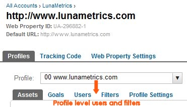
What you’re looking at now are the settings for a single profile, the one shown in the Profile pulldown list (the same profile whose report you just viewed). The tabs below the profile name are the Assets, Goals, Users, Filters, and Profiles Settings for that profile only.
Above the profile name are tabs for this Web Property level, including the Tracking Code (with this unique Web Property ID number) and the Web Property settings.
So what do you do if you need another tracking code number? You create a new Web Property. And you can do that at the Account level.
Follow the Bread Crumbs to the Account Level
The trick to orienting yourself in the Account and Profile Settings is to follow the bread crumbs at the top of the page. Our tour began at the deepest level, in a single Web Property with a single profile selected.
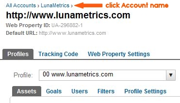
So to go to the Account level, click on the Account Name in the bread crumbs at the top. Now the tabs say Webproperties, Users, Filters, Data Sources, and Account Settings. Here you can choose the button for + New Web Property if you want to get another snippet of code with a new tracking number.
There are a couple other important features here as well. In the old interface you may have known them as the User Manager and the Filter Manager. If you didn’t know them, allow me to introduce you.
Discovering the User Manager and Filter Manager
There are times when you need to make user or filter changes only in one or two profiles. And the new clean profile switching works great for that here behind the scenes, the same as it did up-front in the reports.
But if you have changes to make in lots of profiles, checking them one at a time is not so great. Or if you simply need information about a particular user (which profiles does he have access to?) or a particular filter (which profiles use that filter?) then checking one at a time is also clearly suboptimal.
Here at the Account level, the Filters tab is the same as the Filter Manager, and the Users tab is the same as the User Manager.
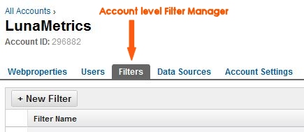
With these tabs, you can apply changes to multiple profiles all at the same time. Or you can just look up information about a particular user or filter. Click the Filters tab and then click any filter to see how this works.

When you select a filter, you’ll see a list of all the profiles currently using that filter. You can easily add or remove profiles, or just make a note of which profiles use this filter.
You’ll see something similar when you select a User under the Users tab (but not for Administrators, since Administrators have access to every profile). Give a User access to multiple profiles or remove access here, without having to visit the Users tab for each profile one at a time. It’s supposed to work the same way, but for now, it doesn’t and you’ll have to set User access one profile at a time.
Last Stop – Account Administration and Back Again
And finally you can even go all the way back up the trail of bread crumbs to the highest level, by clicking All Accounts.
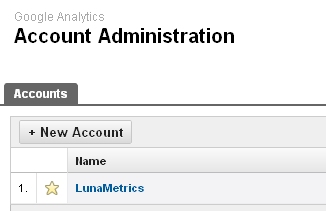
Here under Account Administration you’ll see the accounts you have access to and whether you’re a User or Administrator for each one. The button to create a new account is here, too.
Navigating back down into an account, to a web property, to a profile, feels more intuitive than the upward climb through the bread crumbs. It’s a little more obvious where you’re going. After a few trips up and down, the tabs at each level will become familiar landmarks and you’ll be a pro.
The navigational tools in the downward direction are mostly familiar, too. You can use the page navigation in the lower right, or even “star” frequently used accounts and web properties (alas, not profiles). And type-to-search is available at every level. It’s my favorite way to get where I want to go fast.
What do you like (or dislike) the most in the administrative settings of the new interface? What’s missing or what do you wish Google Analytics would change? Please share in the comments.