Use Google Analytics To Design Your Mobile Site
Don’t have a mobile site? That doesn’t mean you have no mobile visitors. In fact, Google Analytics is already measuring visitors from smartphones and tablets to your site, and you can use this data to figure out what’s important to these visitors and how well your site is working for them.
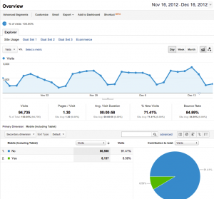
You can see mobile visitors in the Mobile reports under Audience. First, there’s the Overview report, which just says “how many visits came from a mobile device” (and that includes tablets):

Anecdotally, having looked at the data for many different clients and trainees, I see between 5% and 15% of traffic coming from mobile even for sites that don’t have a mobile version, and that proportion is growing. So if you’re not yet thinking about how you’re addressing a mobile audience, you probably should be!
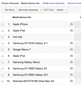
You can also take a look at the Devices report to slice and dice by individual devices, OS, carriers, etc.

Mobile Advanced Segment
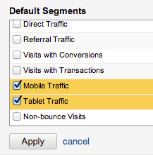
Most usefully, however, Google Analytics provides two Advanced Segments about mobile that you can apply to any report:

The Mobile Traffic segment includes both smartphones and tablets; Tablet Traffic includes just tablets. You can apply these to any report you like, and compare the performance (by visit duration, bounce rate, conversion rate, or any other success metric for your site) for mobile visitors vs. regular desktop visitors. This can give you an idea of whether your current site works as well for visitors on these devices (especially on a smaller screen) as on a regular desktop browser.
My Favorite Tip: Content for Mobile Visitors
Take that Advanced Segment, and apply it to the All Pages report. This will tell us which pages mobile visitors are looking at.
What you may find is that the content consumed on mobile devices is different from what’s popular with regular browsers.
For example, I once took a look at this for a university. For regular visitors to their site, the most popular sections were things like the academic departments, admissions, and so on, just like you might imagine from looking at the main navigation. For mobile visitors, however, there were some really popular pieces of content that weren’t even close to the top in the overall data. This included things like:
- The campus bus schedule
- The page listing the hours the library is open
- The page listing the hours the cafeteria is open
…and so on. All the kinds of things you want to know when you’re on the go with a phone in your hand! This was really helpful in deciding what they’d prioritize in the navigation of their mobile site. Instead of making these pages 6 clicks (or a search) away from the home page, they know to make them immediately accessible for those visitors.
So take a look at the data you already have about mobile visitors in Google Analytics, and see how it can inform the design of a future mobile-optimized site.
What have you noticed about your mobile visitors? Let us know in the comments!


