Gaining Insight From The Locations Report In Google Analytics Using Designated Marketing Areas

“There are three things that matter in property: location, location, location.”
-Various Attributations
The saying “location, location, location” has been attributed to a few different people (primarily Lord Harold Samuel and William Dillard), with apparently no clear indication of who said it first, though the paper of record found the term “location, location, location” in a real estate ad in the Chicago Tribune listed before either man had exited puberty. Given the word “location” is a direct adoption from latin, it’s possible that thousands of years ago a Roman real estate magnate when asked why the Hippodrome was doing so well replied “location, location, location” verbatim.
Regardless of who said it first, it’s a widely accepted caveat that location is important. Yet I’d personally never spent much time with the Locations report in Google Analytics. More often than not clients either were targeting very specific metro areas intentionally, or they were targeting everyone nationally. The Locations Report just never felt like it was a treasure trove of information.
Boy howdy was I wrong.
It’s Where People Live, Stupid…
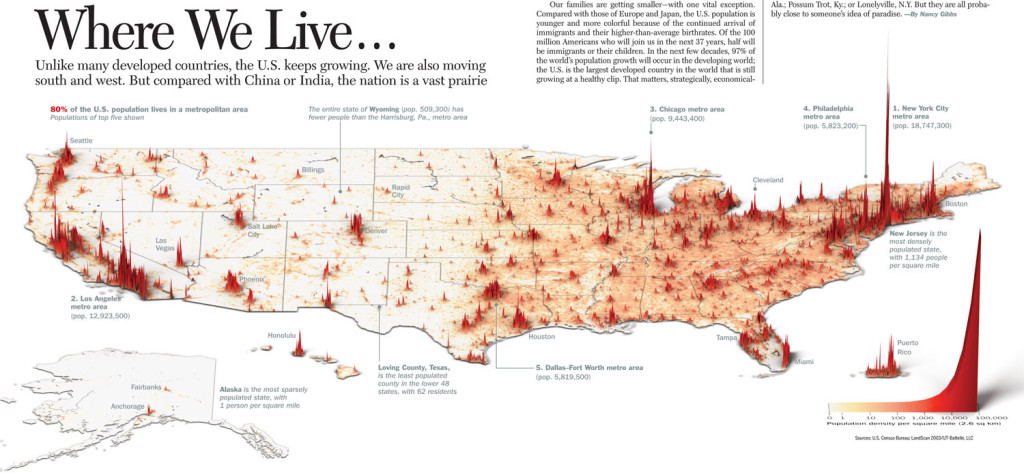
Looking at a national map of visits or transactions just tends to mirror the population of those maps. Same with states, obviously. Too often I’ve seen someone display a national map when doing an analysis of traffic and attempt to pull some sort of insight from it, when all it does is mirror where people live. Of course there are more visits from New York City. More people live there. A huge number of people more. I’ve written in the past about the dangers of bad visualizations particularly in regards to maps. I found the above image online, which I think originally came from Time Magazine, but I can’t find the actual provenance. Lots of times you’ll see a 2 dimensional population map (like in Google Analytics) and it really doesn’t hammer home how many people live in New York City, and how dark that metro area should be colored. The above 3D map shows that spike of population which even makes Chicago and Los Angeles seem tiny. Also it really lays out how ’empty’ much of the country is. I mean look up in Montana or the Dakotas. Just a couple of blips.
(I’ll come back to them in a second.)
I could have told you before looking at the national map where most of the visits would come from. Here I’ll do it for you and your site if you have any kind of national or international traffic: New York, Los Angeles, Chicago, Philadelphia, Dallas, San Francisco, Boston, Washington DC… Am I close? If you’re more regional I’ll swap one or more out for Atlanta, Houston, Detroit, Seattle, or Phoenix.
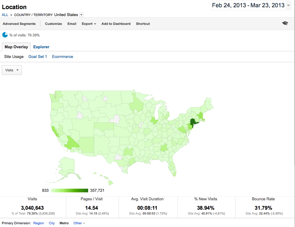
It’s not really shocking when you look at the national map. It’s pretty much the population map of the United States. If you’re regional it’ll be skewed. If you have very specific traffic, it’ll be skewed. But in general, for most sites, when you look at your general visits, it’s going to match the national population map.
And looking at the cities never was easy either. Google Analytics would only show you the top cities from your reports, and once again they mirror population, though you can at least start to dig down and compare city by city conversion rates. Have fun sifting through over 10,000 cities listed in some of your reports, often small areas right next to other small areas, and not even accurate to the very city they are in. For instance right now I’m in the city of Pittsburgh, but my location in Google Analytics? Not Pittsburgh. Carnegie. Not to mention that I’m on my laptop, and when i’m at home tonight my city will change.
But recently reading Jonathan’s blog regarding the locations report I was reminded of the metro view, and decided to take another look. I knew there had to be some really good insight to be found there, if I just took some time to look. The Metro dimension is mapped to the Designated Marketing Areas, and act as fairly good groupings of entire metropolitan areas. They cross state and city borders to get something meaningful. If you want to differentiate Hoboken, NJ from Manhattan you still can, sort of, by looking at the City dimension. But if you want to gather together all the little towns and identifiers around a city, you can look at Metro. When the Metro dimension was introduced to Google Analytics you actually were limited in how you used it. At first it was hidden from nearly all reports, and then even when it was unhidden you couldn’t make Advanced Segments with it. You were limited to just looking at the DMA map in the Locations report and seeing what the results were for each Metro area. Useful to a degree, but awkward. But now you CAN use the Metro dimension in Advanced Segments, and I decided to take a look.
Montana vs New York City…. FIGHT
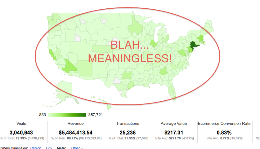
In general there is simply nothing to gain from looking at the national map and seeing that the DMA for New York City produces more traffic, transactions, and revenue than the DMA for say Glendive, Montana. With it’s whopping 4,000 television households, compared to New York City’s 7 million, what can possibly be gained comparing those two “cities”?
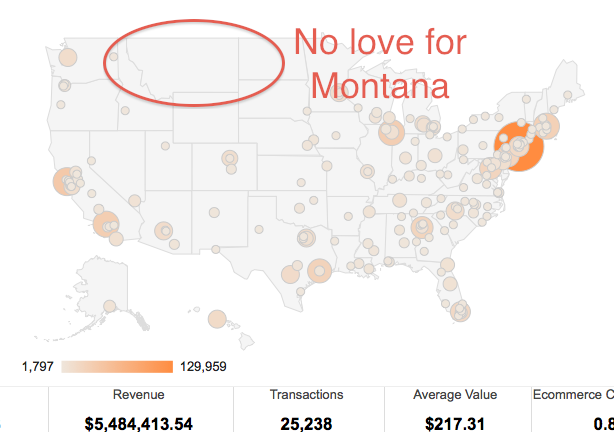
And as I said entire states look like they have little to no traffic at a quick glance, particularly when you drill down to the city map. Or at least meaningless traffic. Who cares about Montana? Look they don’t even register a dot on the city map, just like the general population maps. You end up focusing on JUST the big cities, but even those cities are just cities. New York different from Hoboken. Even just looking at Dallas you see multiple close bubbles. Dallas, Fort Worth, Irving, Arlington, Plano… And nothing in Montana. No love for Montana. There’s obviously no significant traffic from Montana worthy of insight right?
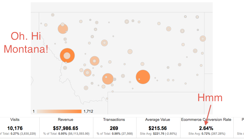
But of course if you drill down to Montana… Traffic. But wait. The national conversion rate was 0.83% on our example site, but here in Montana it’s 2.64%. That’s interesting. Why is it so much higher in Montana? I mean sure it’s only 1% of the revenue total for the site, but what’s the difference?
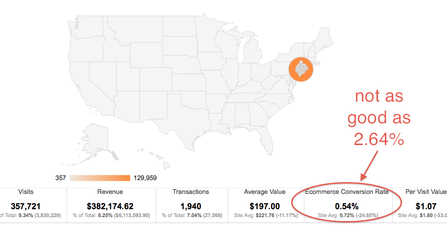
New York’s Metro DMA pretty much does worse than Montana. In nearly every respect (except you know… in total revenue). Let’s look at the Montana DMA’s (which overlap with some other states up there).
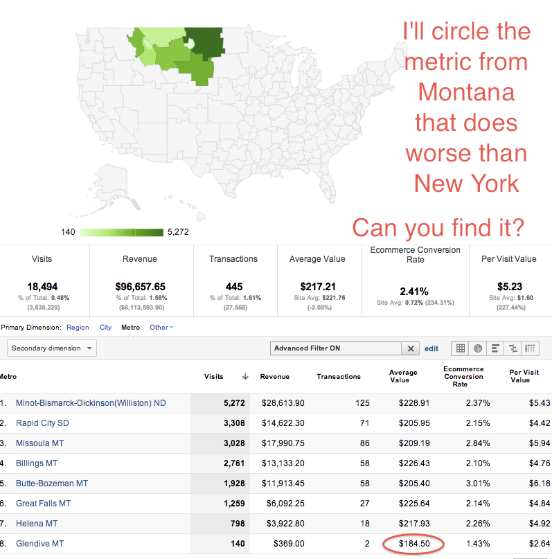
New York’s metro area had over 9% of the TOTAL site traffic, and 6.25% of the total revenue, and over 350k visits. Montana’s DMA’s (which have crossover into the Dakotas)? Just over 18k visits, less than half a percent of the total site traffic. Yet it also accounted for 1.58% of the site revenue, and each visitor was 5 times as valuable. Montana visitors spent more, more often. Well…other than those cheapskates in Glendive. For shame, Glendivians…
Even when you factor for population though, it’s better. The NYC Metro had a 0.54% conversion rate, a $1.07 per visit value, and a $197 average value, with 1,940 transactions in our time period. Montana’s DMA’s had 445 transactions, a 2.41% conversion rate, with a $5.23 per visit value, and a $217 average value. Better in every way. Of course New York has far more population, how does that factor in?
New York’s DMA has 7,387,910 Tv households to the 556,980 TV households in the Montana/Dakota DMA’s we’re comparing (Missoula, Billings, Butte-Bozeman, Great Falls, Helena, Minot-Bismarck-Dickinson, Glendive, and Rapid City). When factoring for population nearly 300% more per-captia population transacted from the Montana DMA’s than from New York. 5% of New York’s population, but a quarter of it’s revenue.
Segmenting the DMA’s
When I was first looking at the Metro dimension, I focused on the top metro areas, creating four segments. One for the top 10 metro areas, one for the next 10, and so on. Quickly this became apparent that I would just be repeating the mistakes of the past. The top 10 segment had far more population than the next 10 (more than a quarter of the entire countries population). So we dug up the population figures published by Neilsen regarding the DMA’s, which listed out how many Television Households were located within each. I decided to use this as my benchmark, and I proceded to split the US DMA’s into 4 separate Quartiles with relatively even population from 27 to 29 million television households within each.
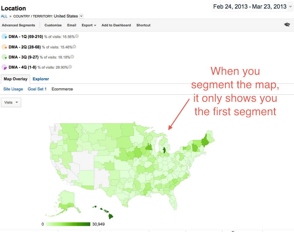
The Top “4th Quartile” consisted of the largest 8 DMA metro areas: New York, Los Angeles, Chicago, Philadelphia, Dallas, San Francisco, Boston, and Washington DC. The next “3rd Quartile” had the next largest 19 Metros: Atlanta, Houston, Detroit, Seattle, Phoenix, Tampa, Minneapolis, Miami, Denver, Cleveland, Orlando, Sacramento, St Louis, Portland OR, Pittsburgh, Raleigh-Durham, Charlotte NC, Indianapolis, and Baltimore. These were followed by 42 metro areas in the “2nd Quartile”, and the remainder of the 210 total Metro areas in the “1st Quartile”.
It wasn’t perfect. The 1st Quartile contained some areas that might be considered fairly “metropolitan” at least in behavior. Honolulu, East Lansing Michigan, Madison Wisconsin for instance, but it was far more populated with metro areas like Macon GA, and Lincoln Nebraska. Also I should note that we made sure to exclude the (not set) from the 1st Quartile which was essentially what was NOT the 2nd, 3rd, and 4th Quartile metro areas.
If you want to use the regular expressions I used to create your own Advanced Segments here they are:
4th Quartile:
New York|Los Angeles|Chicago|Philadelphia|Dallas|San Francisco|Boston|Washington DC
3rd Quartile:
Atlanta|Houston|Detroit|Seattle|Phoenix|Tampa|Minneapolis|Miami|Denver|Cleveland|Orlando|Sacramento|St. Louis|Portland OR|Pittsburgh|Raleigh-Durham|Charlotte NC|Indianapolis|Baltimore
2nd Quartile:
San Diego|Nashville|Hartford|Kansas City|Columbus OH|Salt Lake City|Milwaukee|Cincinnati|San Antonio|Greenville-Spartanburg|West Palm Beach|Birmingham|Las Vegas|Harrisburg-Lancaster|Grand Rapids|Norfolk|Oklahoma City|Albuquerque|Greensboro|Austin TX|Louisville|Memphis|Jacksonville|Buffalo|New Orleans|Providence|Wilkes Barre|Fresno|Little Rock|Richmond-Petersburg|Albany NY|Tulsa|Mobile|Knoxville|Ft. Myers|Dayton|Lexington|Charleston-Huntington|Roanoke|Wichita-Hutchinson|Flint|Green Bay
1st Quartile:
Exclude the above expressions, as well as “(not set)”
First Impressions on the DMA’s
It was striking to me immediately on the site I was investigating at the time. While the population was nearly equal for each Quartile (within about 5%) the visits from the biggest cities were a much greater share of the overall traffic on the Web Property I was looking at. Maybe not surprising? Maybe the urban areas tended to be online more? But what really stood out was that even though the traffic was nearly one half from the first quartile than the fourth and largest quartile, it nearly was equivalent in revenue. 8,648 transactions from the 4th Quartile, but 6,919 transactions from the 1st quartile. A better conversion rate, a better average value, and a better per visit value.

That was acquisition though, how about activity? What were they doing on the site?
Well it turned out that they were even using the site differently. Visitors from the top 8 cities were using the site search more, twice as often as those from the 1st quartile. Not only that, they were searching for specific product brands far more, and even hitting specific ‘on site’ category/brand pages at a far higher rate, as well as pages focusing on different styles and aspects of the products.
Meanwhile the 1st quartile visitors were more likely to shop by special sales pages, or by budget. However, when the 1st quartile visitors DID shop like the visitors from the larger cities, they tended to spend far more money and have a much higher per visit value (almost double).
I decided to look for more differences between quartiles when it came to their outcomes. The site I was looking at sold thousands of different products, so I compared the top ten products for each quartile. The most striking thing to me was that the best seller in the first quartile didn’t even make the top ten products in the fourth quartile, and the same in reverse. Product preferences matched between 40-50% of the time from quartile to quartile, but only 3 of the 10 products in their top 10’s matched between the fourth and first quartiles. Not only were they shopping differently, and buying more, they were buying different things.

Second Impressions of the DMA’s
The truth was, it really differed site to site. Some sites showed remarkably strong first quartiles, others strong fourth. I didn’t see any that were particularly strong in the midrange, but sometimes there would be spikes in traffic per quartile and DMA which led to interesting insights. Why was there suddenly a burst of social media referrals from the 3rd quartile? Insights like that. Sometimes the first quartile ecommerce was just better at converting….
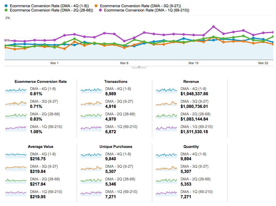
Others, not so much. Sometimes the amount of traffic favored the big cities by a 10 to 1 margin, and the conversions were better too.
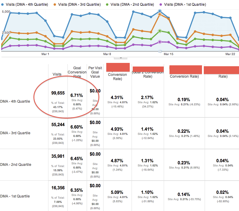
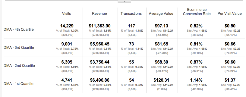
Still others showed considerably weaker traffic acquisition from the smaller metro areas, but stronger conversion rates than the larger ones…
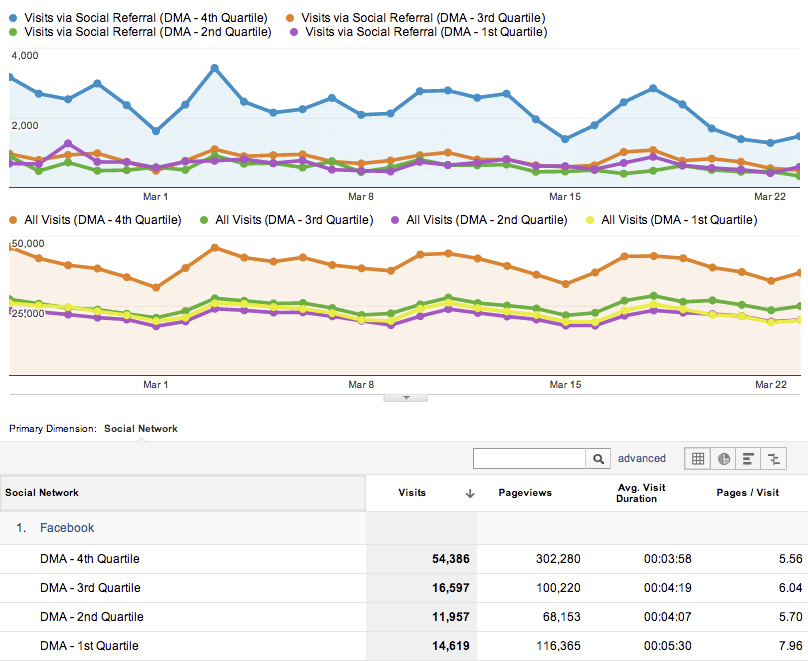
And sometimes there were sharp differences in behavior, with social referrals heavily favoring the big cities, rather than the smaller ones.
Each property and profile was different. From how they acquired traffic, to what users did, to what their outcomes were, there were almost always insights to be gained via comparing the DMA’s by quartile, and digging in further.
You MUST Geotarget Glendive, Montana or “What do I do with all this?”
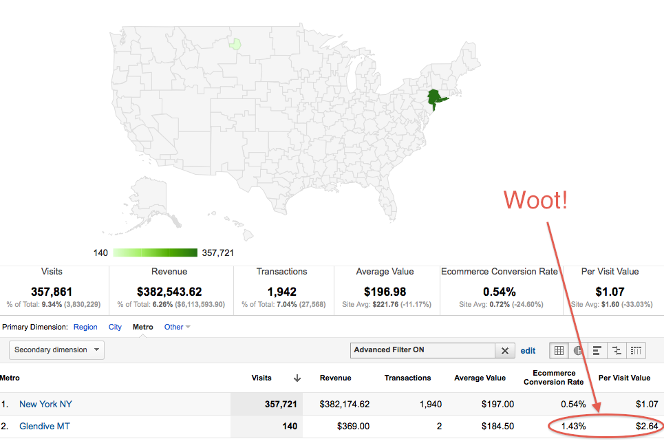
Here’s where the rubber hits the road. What’s the point of all these numbers if we don’t do something with them? It’s great that the 4,000 TV households in Glendive, Montana convert at a rate nearly 3 times higher than those in New York City with over double the per visit value, but… Well there are only 4,000 TV households there. That’s not alot of people. It’s not a particularly large sample size when we’re talking about 2 transactions. The brutal honestly is that it’s EASIER (and in many ways cheaper) to target the big cities, and ignore the “first quartiles”.
Recently Andrew Garberson, as well as Sarah Peduzzi both wrote about location from SEO and PPC perspectives in a weird case of synchronicity with my prep for this blog post, and generated several discussion internally at LunaMetrics regarding what a digital marketer could actually do with this information. I decided to look at how one could use this data in acquiring traffic, monitoring user activity, and then their visit outcomes.
Acquisition
When you consider Search Engine Optimization, you need to consider what your focus is. Many companies are geotargeting cities, towns, metro areas, all over. It takes a lot of your link juice from a single page, to create several smaller pages, but perhaps it increases conversions? For instance let’s take our above first example. Assuming the site has no geotargeted landing pages, then they keep all their search engine mojo on their main landing pages, but if you were to create 210 different landing pages for each different Metro area, then suddenly you’re spreading that wealth around. That could hurt your overall national search engine rankings, depending on your overall strength. However if you wanted to target these searches, you could use the Metro dimension to look into where people are converting well, and what they’re doing, and how they’re converting, and then tailor your landing pages and keywords for those people. If people in Glendive, Montana are searching for Wooden Multivariate Widgets, and people in New York City are searching for Steel Unipurpose Widgets then you can write and create specific content focusing on these users, and their geolocations. Reading the differing keywords, and ways people search between Quartiles, as well as different metro areas, can give you insight into how your users are finding your sites differently, from different regions, and help you target your content towards those visitors even better.
Paid Ads are different. Google Adwords for instance lets you specifically target these DMA’s. If you know that the 1st Quartilers are converting better, why not target your ads to them, rather than to New York City? Well turns out there can be complications. Focusing an ad on Glendive might actually cost MORE than on New York City, simply because there isn’t really isn’t as many people clicking on the ads in the smaller DMA’s. However, knowing that your visitors are searching for different products, and spending different amounts, can lead you determine it’s value. And the ads placed there might actually be cheaper! Imagine if you could suddenly target a population the same as New York City but that converts 3 times better while spending more money? Wouldn’t you want to target them for your ads over the Big Apple? If your data shows these similar numbers, it might be worth doing some specific DMA targeting to test out the costs, and see if your cost per conversion is lower by targeting more smaller areas.
Activity
The Landing Pages that visitors land on can be key to leading them to conversions. However you land on the Search Engine Optimization issue, it could be worth it for you to investigate using different content on your primary landing pages depending on where the user is from. For instance if you have a big sliding header banner (which by the way aren’t awesome for conversions, but that’s a separate issue) you might want to tailor what images show up in it depending on where people are from. Are they from Montana? You might want that Wooden Widget Special to show up first. New York? The Steel Brand Name Widget. What do people search for on the site, what pages do they visit, and what products do they purchase? Use these to tailor your landing pages based on the user geolocation.
Site Search can be a big part of a site. Sometimes it’s meager, sometimes it’s a considerable amount of traffic. When I think of the advanced site search features with different dynamic options being delivered before a visitor even clicks search, or even simply how the results are delivered, can be affected by your metro insights. If the user is from Montana and searches for Widget, you might want to put the Wooden Widget at the top of the list of dynamic items being offered. If the user is from New York and they hit search, you might want to have the Steel Widget result placed at the top of the search results.
If you’re a content site, maybe you have one of those “fly outs” at the bottom of the page suggesting different topics. If users from Montana read more about Wooden Widgets, then maybe you focus those results to put preference on Wooden Widget articles and posts.
If you’re offering “products you also might like” on a shopping cart page, you might want to consider using the top related products not for the site overall, but from the users quartile, or metro area.
Outcomes
It all comes down to getting your visitors to reach your established Goals, whether that’s ecommerce or just goal conversions. Maybe the goals are different between quartiles and metro areas, and maybe they’re the same. A widget is a widget whether it’s wood or steel. Yet if you watch how your users use your site, you might discern reasons they are more likely to convert. Whether it’s collecting better traffic in the first place, or giving them more directed activities on the site, you can help funnel them to your goals better.
Run Content Experiments, and see how different quartiles perform (if you have enough traffic for it). Maybe a red “buy now” button does better in New York, but worse in Montana where the green button prevails.
Watch your funnels. Maybe New Yorkers aren’t put off by having to log in via facebook or twitter, but your first quartile visitors could be leaving in droves. That might indicate a good place to put a way to log in without a social network, or even convert without logging in.
Maybe your visitors from one quartile react better to certain email marketing than others, and are far more likely to convert when sent a particular email.
This is the end. My only friend, the end.
The truth is that there is almost limitless insight that can be pulled to improve your site performance from the Locations report. The report I once neglected is now one of the first ones I look at. Maybe there isn’t any differentiation you can tell on your site between quartiles. That happens. But if there is, and the majority of the time something WILL be different, then it can be invaluable insight into what you’re doing, how you’re getting traffic, and moving your users towards conversions.


