Visualize Any Data With Free Google Data Studio

As Google Analytics has evolved over the years, new features have been introduced to help visualize the immense amount of data collected about websites’ users, their behavior on a website, and how they found the website. Custom reports and dashboards have made it easy to add simple chart elements with tables of data to help summarize or focus your analysis.
Data Studio is not part of the Google Analytics evolution. Data Studio is not the next level of visualization with the newest types of charts. Rather, Data Studio is a completely separate product more closely related to Google Sheets and Google Docs. That it visualizes Google Analytics data really well is why we’re particularly interested in it, but let’s set the stage appropriately.
The concept is simple – let’s make a tool that makes it easy to connect to different data sources and create visually appealing and dynamic reports.
But how will we get people to use it? Well, Google’s thought of that too. Let’s make it free for the first five reports.
Ok, now we’ve got your interest piqued. Let’s dig deep and talk about Data Studio and whether it’s a good choice for you!
What Will I Use It For?
Because it was announced with the Google Analytics 360 Suite – many people will mistakenly think that this tool is just for Google Products. Rather, the tool will work for any data that you’d like to visualize. At the time, the caveat is that it must an available data source, and if it's not already included, it can be made to work by saving it in a Google Sheet.
- Heatmapping states within the US? Piece of cake.
- Measuring Budget vs Actual? Why not!
- Measuring a metric over time? Of course!
I can think of immediate uses for my friends in academia and public health, or my former coworkers in health care or entertainment! Doesn’t every business need reporting in some capacity? If only I had this tool back then!
For the readers of our blog, the most obvious use cases involve our friends Google Analytics and Google AdWords – and here too the benefits are clear! Compared to the visualization options we have within the Google Analytics interface, Data Studio represents a dramatic shift. Like Dorothy leaving her black and white world via tornado and arriving in colorful Oz, our data is transported to a new and foreign landscape with seemingly infinite potential.
As most posts about Data Studio will point out the easiness of creating reports and the comparatively vast amounts of customization possible, I’ll instead focus on some of the practical reasons why using Data Studio is worth investigating.
Dynamic Updates
One of the best “pros” for using Data Studio is the live connection between Google Products. As soon as you leave the GA ecosystem to begin creating a report, you have the challenge of figuring out which tools or processes are necessary in order to bring in the correct data.
Think to your current process for creating a report.
“Can I use an existing report?”

“How about a Custom Report?”

“Well, what about a dashboard?”

“I guess I’ll have to take this outside.”
How does this work? Do you download a CSV and import it into Excel each week? Do you try to use some combination of free or paid tools, like Shufflepoint for Excel, or the Google Analytics Add-On for Google Sheets? Are you creating a connector for Tableau or even an intermediate Google Sheet which then feeds into Tableau? At every step of the way, complication is introduced.
We now need to deal with authenticating, that is proving that you are who you say you are and that you receive the correct access to your data.
We now have to deal with data freshness. How often does the data update? Is it automatic or does it involve a manual process?
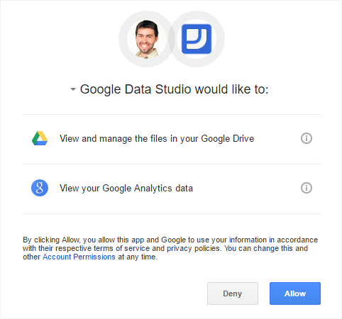
Data Studio takes away almost all of these challenges. By living in the same Google-sphere as Google Analytics, it’s easy for you to give Data Studio access to the same Google Analytics data that you have access to.
We call these data sources, and there are several built-in data connectors to existing Google products.
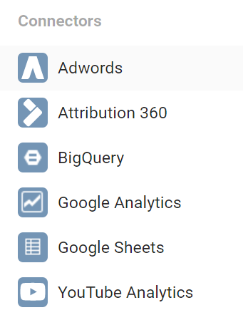
These connections are “live,” which mean that we can change the date and our reports will update. We can use time periods like “Last 7 Days,” and refresh the report each day to update charts/tables/metrics. It works like a charm!
Getting The Word Out
So we’ve got our data linked up, it’s feeding data from our Analytics/AdWords accounts. Let’s just skip ahead for a second and assume we’ve created the most visually appealing report you’ve ever seen. Charts on charts on charts, mind-blowing color scheme, you can imagine it.
Now what?
Again, let’s think about the competition. If you wanted to distribute your report to your peers or your boss, we’d have to think about how each tool handles this.
At the simplest, we create a report and email a spreadsheet or attach a PDF. We can try to use a tool that offers a web interface, like Tableau, but again we’ll have to deal with who should have access and what should they be able to see. Different audiences will require different types of reports and different access.
Boom. Data Studio to the rescue.
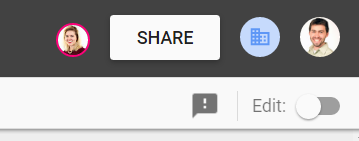
If you’ve ever shared and collaborated on a Google Doc or a Google Sheet, then you get it. The Google Drive sharing is exceedingly simple. Click the Share button, enter email, decide if they should be able to Edit or View.
They’ll get emailed a link, they’ll see it in their Shared With Me section in Drive.

In order to view, they need the Internet. And quite possibly Chrome for the best experience, though I imagine it will get steadily better in other browsers.
By connecting data sources and creating the report, all of the information in the report will use your data. Anyone that Views the report will be able to manipulate using on the controls you provide. They’ll be able to see what you’ve allowed them to see, regardless of whether or not they have Google Analytics or Google AdWords access. Compare to Dashboards inside of GA, which can be emailed automatically, but require access to GA in order to manipulate date ranges or add/remove segments.
Data Studio makes it easy to share.
Visualize This
Think about what products you’re currently using to visualize your data. Microsoft Excel and Google Spreadsheets, though less sexy than their big bucks competitors, still likely remain king for their ease of use and widespread availability. Data Studio is arguably as easy to use as both of these tools, with slightly less customization for individual chart elements.
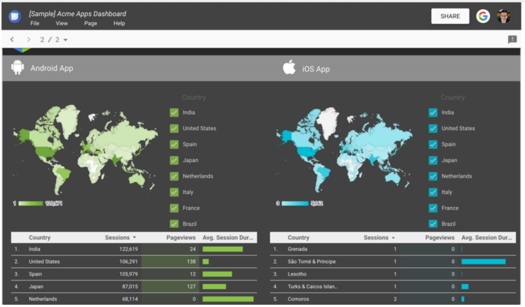
Drag and move items around the report, draw shapes and text, import images, customize colors and settings for individual items – these features all sound pretty basic and reliable.
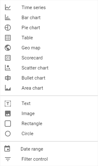
Compared to anything within the Google Analytics interface though, these features are huge! I can add IMAGES?! I can brand it for my company?! You’ve got your basic charts and giant metrics, but let me call out of some of the really interesting parts.
Multiple Pages
The entire report-building process seems like editing a Word Doc inside of the Google Doc interface. Where Google Docs can be long, scrolling pages, the Data Studio reports are organized into Pages. So yes, while you’re limited to five free reports, you are able to include multiple pages in each report.
Consider grouping your reports around common interests, business divisions, different tools, or if you’re mostly focused on Google Analytics, consider Audience, Acquisition, Behavior, and Conversion.
Control Features
Data Studio comes baked in with some controls that you can add to your reports. The first and most obvious need is the Date Picker. Add this to the report and your visitors will be able to adjust the time period and refresh the report ad nauseam, without ever bothering you!
They’ve also included a pretty spiffy tool called a Filter Control. This allows you to add a table to your report that is narrowed to focus on a specific Dimension, perhaps something like your Default Channel Grouping. More than just displaying your channels and their respective sessions, the viewer of the report can select or deselect channels to decide what data is included in the report their viewing. Create a website summary report and now you’ve given viewers the option of drilling down into specific areas.
When you add these controls, you get to choose whether they affect just the current page or the entire report.
So Many More Options
Compared to Google Analytics dashboards, you now have so many more options for reporting, comparing, and visualizing your data. No longer are you limited to 12 widgets or a small number of charts. Instead, you decide how many charts and pages your report will have, and you’ll choose the visualization and data that best gets your message across.
Additional Resources
Data Studio right now is just getting started! Import some data, start playing around, and you’ll quickly learn how flexible the tool really is. There are a number of great resources out there, many from Googlers, talking about, demonstrating, and explaining Data Studio.
Take a look through a few of these links for some ideas about how to visualize and what possibilities exist.
- Announcing Data Studio: our free, new, Data Visualization Product – Google Analytics Solutions Blog
- Introduction to Google Data Studio – Google Analytics Youtube Channel
- Google Data Studio: A Step-By-Step Guide – Daniel Waisberg, Online Behavior
- Showing off the new (free) Google Data Studio, with Reddit April’s gilded comments for Sanders/Trump/Clinton in BigQuery – Felipe Hoffa
- Google Data Studio for Ecommerce Businesses – Google Analytics Solutions Blog
- Data Studio: New, Simplified, AdWords Connector – Google Analytics Solutions Blog


