Developing A Data Studio Reporting Strategy
If you read our blog regularly, you’ve heard about Google Data Studio, a great new product from Google that’s designed for data visualization and reporting collaboration/sharing. If you haven’t already created a few reports, make sure to check out Jon’s excellent overview of the tool and its features before you get started.
Similar to other reporting tools like Tableau, you can connect multiple data sources to Data Studio and create customized visualizations. You can even get granular with stylization. But, while it’s nice to be able to make reports look pretty, it’s equally important to focus on the data. Remember why we’re creating reports in the first place – to visualize data in ways that make it valuable and actionable for its audiences. Like any reporting or implementation efforts, it can help to have a strategy for Data Studio before you dive in.
Step 1: Know What Needs to be Reported and Why
The first step, if you haven’t done this already, is to identify the goals for your website – this is a must! Determine what data you’ll use to measure goal achievement; different users or teams may have their own goals and metrics that they use for measurement and analysis. If you don’t have an idea of what you hope to accomplish with your website, it will be difficult to visualize success.
In addition to pinning down your objectives, you’ll want to make sure you have systems in place to collect the right data, whether through Google Analytics or another source. By establishing key metrics early on, you’ll have direction when building reports later.
Step 2: Decide if Data Studio Will Meet Your Reporting Needs
Will Data Studio be used as the final data visualization, or do reports still need to be shared in a different format? Identify who will be using the data and in what applications. There are often many people using datasets to measure their achievements and contribution to reaching goals.
Data Studio works well for situations like the following:
- You have several individuals on your marketing team who routinely report on campaign performance, site engagement and goals.
- You have mid-level managers who oversee multiple locations or regions; they want to easily view individual and aggregate reports.
- You work with several 3rd-party vendors for advertising, SEO and email marketing. They want to frequently analyze what efforts are working well, at a high level, without logging in to Google Analytics and AdWords.
- You need more flexibility in the way data is presented – with control over the colors, branding, and data and the ability to incorporate notes and insights throughout.
- You present reports to others and want more interactivity, with the ability for you and your report viewers to filter and explore without technical expertise.
Data Studio can be a great option for some, but not meet the needs of others. Keep in mind that Google Data Studio is still in beta, and they are constantly making updates, fixes, and adding new features! Don’t believe me? Check out the release notes, they’ve been updating Data Studio about every week or so. So while some features may not be perfect just yet, remember that Google Data Studio will just continue to get better!
One of the best features of Data Studio is the ability to dynamically interact with the report, changing the date range, filtering elements, etc. Understandably, however, many will see Data Studio as a replacement or upgrade for existing report visualizations within the Google products they’re currently using, like Google Analytics and Google AdWords. This leads to one of the biggest gripes that we’ve heard so far, which is the limited ability to download or email static reports easily from Data Studio.
Currently, there’s no easy to do this from within the interface. Your browser may support printing the report to a PDF, but you may need to manually stitch multiple pages together. Remember that if you do use a method to save your report as a PDF, you lose the elements of interactivity and shareability that make Data Studio special.
Although our love for Data Studio runs deep, it does have limitations in some cases. In these situations, other reporting solutions may still be a better fit, from basic (Google Analytics Dashboards, Excel) to complex (R, APIs). For example:
- Your organization’s policies don’t allow employees to use Google Drive to create or share documents.
- You need to create reports with international languages and currencies.
- You need to provide a lot of complex data across multiple tabs and tables that can’t be condensed in basic visualizations (Data Studio isn’t a replacement for Excel or Google Sheets).
- Your executive team needs to share a downloaded report with many stakeholders.
- Your marketing team needs to provide reporting to the general public in a universally-accessible format. (Though some would argue Data Studio is a great way to do this!)
- You need to create detailed funnel-type reports that show directional user paths.
- Your company has a complex structure with many departments, locations, or franchises and needs to provide an independent reporting for each. Sharing templates can make this easier, but initial effort and ongoing support will be challenging.
- You’d like to connect many data sources for reporting, like Salesforce, Marketo, Oracle, Excel files, etc. (Data Studio supports many connections, but won’t be a replacement for a data warehouse just yet.)
Step 3: Decide What Data You’ll Report and Where it Will Come From
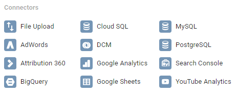
How will you get the data into your reports? Will it come from several different sources? This is where you can plan out what Data Studio connectors you’ll need to use to get the right information into your reports. Data Studio currently provides several types of connectors that allow you to bring in data from Google products (including ad platforms), databases and external files.

The list of connectors has grown since Data Studio first launched, and will likely continue to grow. While it doesn’t include many third-party connectors, it does give you the ability to bring in data from your own databases, an uploaded file, or our personal favorite, Google Sheets. If you can get the data into Google Sheets, via APIS, Add-Ons, or any other method, you can visualize it in Google Data Studio.
For more information about connectors, check out Sam’s post on data connectors and data sources.
Step 4: Map Out Your Report Framework
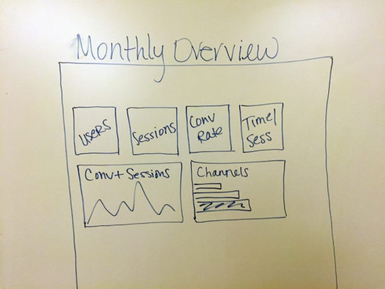
Once you’ve decided that Data Studio is the way to go, start planning your reports, or check out a few templates first. (We have a content template and an ecommerce template!) This is a step that many people skip, but can actually be more efficient. By envisioning the way you want to present data in your reports, you may not end up needing to spend as much time configuring or manipulating the data within the Data Studio interface.

Whether you use a wireframe tool, whiteboard, a sketchpad or MS Paint (no judgement), make this a quick exercise. Based on the goals for your website, what metrics or data show that these goals are being achieved or provide insight into key interactions throughout the site? Whether from Google Analytics or another data source, it’s important to know what pieces of information you want to include in order to make the report useful.
You may have different ways of visualizing data depending on the department or team, and this step helps you make sure your final Data Studio reports are relevant and useful.
Step 5: Build your Data Studio Reports.
Finally! This is the moment you’ve been waiting for. Now that you know what data you want to include and an idea of how it should be presented, set up your data sources and add it to your report. There are several built-in options for charts and graphs, so you can choose the ones that best visualize your data. Then, get creative by adding brand logos and images, customizing colors and fonts, etc. You can even easily add notes and analysis anywhere within the report, which isn’t possible with Google Analytics Custom Reports or Dashboards.
Hopefully, because you’ve developed a strategy and framework ahead of time, you won’t end up spending most of your time formatting. Instead, you’ll be able to dedicate more time to using the reports for the exciting stuff that really matters, like analysis and measurement!


