Data Visualizations: Points, Lines, Bars, And Pies
Most companies are interested in Google Analytics and analytics in general, to give them data from which they can make meaningful business decisions. However, it is not always the case that the person analyzing the data is the one calling the shots. In this case, it is up to you as the analyst to provide colleagues with reports and dashboards that present the data’s findings in a clear and meaningful way.
Data Visualizations Basics
We will start with the basics, and discuss the use cases of four different graph types: Point, Line, Bar, and Pie charts. This is a general overview and will use Google Sheets for the graphing examples. Google Analytics data can be imported into a Google Sheets by using Google’s API Add-On. We can also use Data Studio, or any other graphical software, to make reports.
Data Studio makes a lot of graphing decisions for us -for better or for worse- and limits the design choices we can make. Depending on the graphing tool that we are using, there may be many additional choices available to us, each making our graphs more or less effective and engaging. We want to use the right encoding method to communicate our results. We will discuss these different graphs, their effective uses, and what should be avoided here.
Points
Points are the simplest data-encoding object. They give us a specific value and location in the graph. We can encode additional information about the data, by using different shapes or colors for different facets. For example, if we wanted to distinguish certain facets in our data, we could give each group a differently shaped point such as a triangle, plus sign, dot, etc.
There are only a few cases where points alone are an effective option. The main one is when both axes of our graph are quantitative values. This is kind of graph is called a scatter plot, and is specifically designed to show a possible correlation between the two axes. Points are effective here because they encode two values simultaneously and hardly take up any space, allowing us to plot many values simultaneously on a graph.
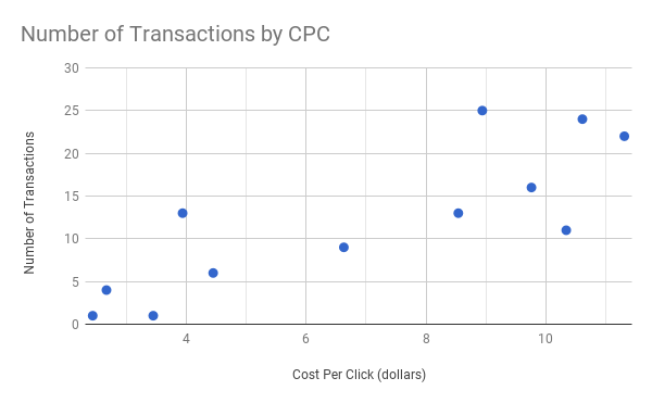
DO: Use a scatter plot to represent the relationship between two quantitative variables.
Points on their own aren’t useful for encoding time series data, that is, data that is recorded at regular intervals for a duration of time. It is difficult to see trends in a graph that only has points. In this case, we need to add in some lines.
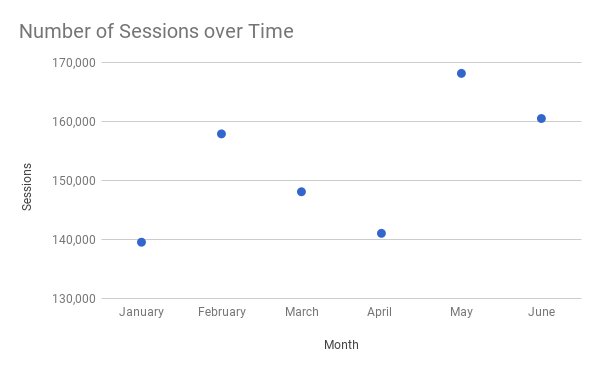
DON’T: Only use points for time series data.
Lines
Lines are appropriate for seeing trends in time series data. Points alone are hard to follow chronologically, but by connecting them with a line or by using a line on its own, the sequence of time-series data becomes easy to follow.
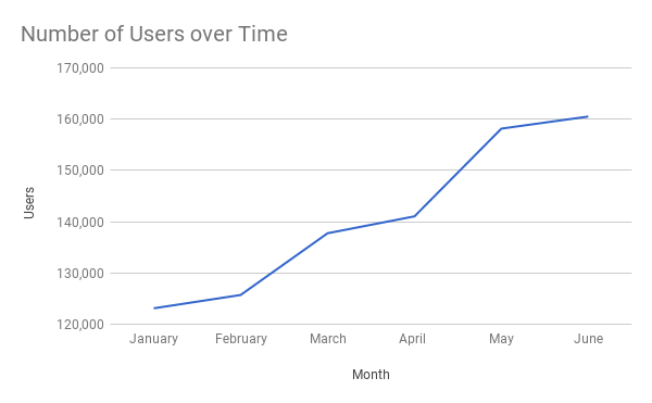
DO: Use lines to show trends in data.
Lines show the overall shape of the values and show trends and patterns. If we want to emphasize the values at specific points, which can be nice for comparison purposes, we can add in those visual points as shown below.
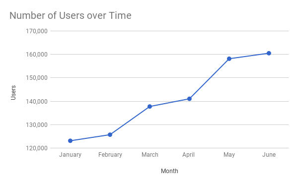
DO: Adding in points emphasizes certain values.
Note that we should never use lines to connect discrete values as the following graph depicts. It doesn’t make sense that we would want to show a continuous relationship between the categories.
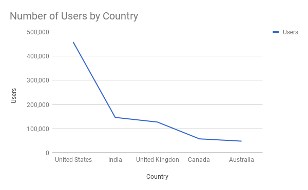
DON’T: Connect discrete values with a line.
Bars
Bar charts are great for comparisons of categorical data. They are easy to read since the placement of the bottom of the bars along an axis makes it easy to immediately see which categories are the largest and smallest as well as the differences between categories. Note that the quantitative axis should always start at zero, otherwise we cannot accurately compare the bars. It is also misleading to users, sometimes even ethically-speaking, to start at a different baseline.
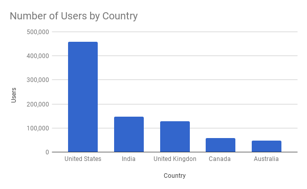
DO: Use a bar chart to compare categorical data.
Bars can be used for time series data if we want to make another comparison within the time scale. For example, bars can be used for comparing budget vs. actual expenses across months. If we only wanted to see actual expenses by month, then a line graph is a better choice.
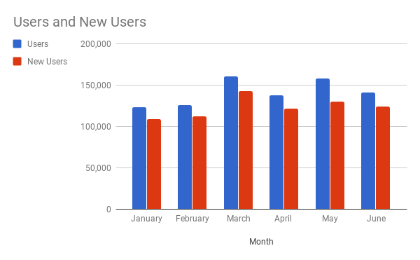
DO: Use bars for time series data when making intra-time comparisons.
There are both horizontal and vertical bar charts, and each has cases where it is the most effective. This blog post makes a case for using horizontal bar charts.
Note that while histograms look similar to bar charts, they are in fact something entirely different. As described above, bar charts plot categorical data and are quantitatively sequential. Histograms show the distribution of data; they also plot quantitative data, but with the data “binned” (grouped into intervals), with no gaps between the bins. The size of the bins is up to the analyst but should be chosen with care in order to give a meaningful representation of the data.
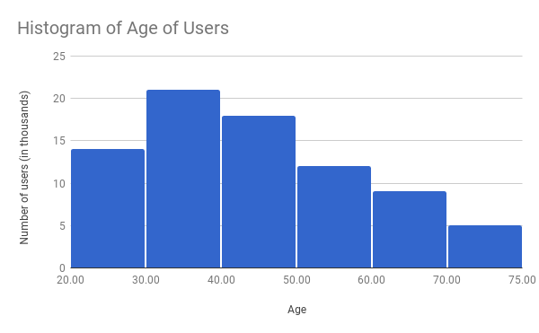
DO: Use a histogram when you want to show the distribution of data.
Fun Fact: Google Analytics has built-in histograms with version 4 of its reporting API. We made a fun tool for you to experiment with your data!
Google Analytics API v4: Histogram Buckets
Published: July 27, 2017
Pies
Pie charts are used to represent the relationship between the parts and the entire dataset. If the parts do not sum up to a meaningful whole, a pie chart is not the right chart to use. Most of the time, pie charts can and should be avoided and replaced with bar charts.
Pie charts can work when comparing two categories. Usually, we can easily visually compare the proportions of two categories in a pie chart. However, because the categories are listed around in a circle and there are no axis lines other than the perimeter, it becomes hard to compare the sizes of the slices for more than two categories. Even though labels and percentages can and should be added to the chart, often times reports are only quickly looked over, and we want to make the information as clear as possible at first glance.
Legends should also be on the left or top so the viewer can read the categories before making a connection to the metrics. Also, it may be preferable to make the colors monochromatic, since the data are representing the same type of categories.
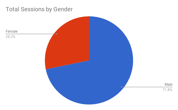
DO: Pie charts can be used if only comparing two categories.
Consider the following pie chart (percentages intentionally omitted). Is the green or orange slice bigger?
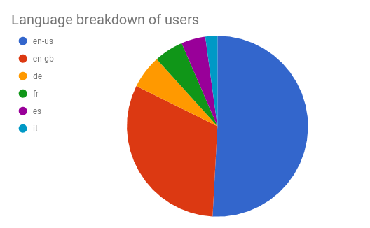
DON’T: Use a pie chart when comparing multiple categories.
Now look at this bar chart. Using gridlines, we can see that ‘de’ is slightly larger than ‘fr’, even when we don’t know the actual number or percentage.
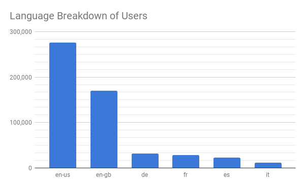
DO: Use bar charts when comparing multiple categories.
There are adamant arguments about the use of pie charts; expert Stephen Few even urges analysts to “skip the pie for dessert.” On the other side, some analysts strongly disagree and claim that pie charts excel at estimation and put the viewer in a better frame of mind to relate the data. Which camp are you in?
Deciding on a Graph Type
We should always stop and think about what our graphs are trying to portray before designing them. If the data is not presented in a way that is understandable, then it’s hard to make others care about it. There are some obvious guidelines that we can follow (for example: If one of the axes is categorical, don’t use a scatterplot), and here is a lovely diagram to help us make a decision on which chart type to use.
Note that most of the chart types in the link haven’t been discussed yet and probably won’t become commonplace in business reports any time soon. However, it’s helpful to see that there is a logical method that can be used when deciding how to display our data. Using these guidelines, we can make reports that are readable, comprehensive, and get others excited about data!


