Data Studio Template: Cohort Analysis For Blogs And Articles

Have you ever wanted to compare the performance of articles or blog posts, but found it difficult because the articles were published on different dates? We have the solution! Check out my colleague Jon Meck’s blog post on using cohorts for content, and then come back to this post for the payoff.
In this post, we give you a free Data Studio report template and we show you how to use it. Our report makes it easy to see how your articles or blog posts are doing. When you find yourself thinking, “I want that!” you’ll also want to start collecting the new data you need to fill your own beautiful report.
Do You Have Questions About Content Performance?
With our Data Studio report, you can answer questions like:
- For recent blog posts, which ones had more views in their first week? First month? First 3 months?
- Over the entire year, what blog post had the best start? The best long-haul performance?
- How did a specific post trend over that time? Did it start with a bang and fade quickly, or did it have a few spikes (maybe due to promoting or viral linking)?
To answer these questions, you’ll interact with the data in our report. You’ll use the blog post’s publication date, plus how many times it was viewed in the first weeks or months after it was published.
Follow our tips below to make the most of the Data Studio features we’ve built into the report, and start finding answers in your data.
How To Find Answers In Your Data
Let’s go through the questions above using some example data, and see how the report can help find answers.
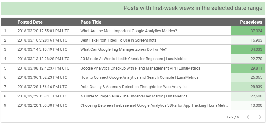
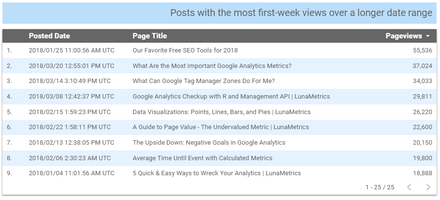
On every page, two tables give you two ways to look at the data. The top table shows you the most recent posts first, color-coded to emphasize which had the most views in their first week. The bottom table lists posts in order by views in their first week, for the whole year-to-date.
Note that every post’s “first week” covers a different span of dates, but you can compare their 7-day pageview totals in the same report because you took the time to collect data for cohorts!
Which recent blog posts had more views in their first week?
Bounteous Cohort Blog Example – Numbers Comically Enlarged
Look at Page 1: “First Week Performance” and check the top table. Because it is sorted by date, you can compare your most recent posts to each other.
Published March 20, “What Are The Most Important Google Analytics Metrics?” had 37,024 views in its first week, likely due to some social media help from @GoogleAnalytics Twitter Account. Posts about GTM zones and mobile tracking had fewer than 20,000 views in their first weeks.
Click the column heading to sort by Pageviews, and see all of the best-performing posts together. Click again to see the worst-performing posts – but remember to check the publication date. (Some of their first-week totals may be incomplete because their first week isn’t over yet.)
To see which recent blog posts had more views in their first month or first 3 months, check the top tables on Pages 2 and 3.
Which blog post had the best start (the best first week) for the entire year?
Bounteous Cohort Blog Example – Numbers Comically Enlarged
Look at Page 1: “First Week Performance” and check the bottom table, which is already sorted by Pageviews by default. Our post about Free SEO Tools has significantly overtaken the Most Important Metrics post, which lead from the top table.
When you look again later this year, you may find that a different post has taken the “best first-week” title – or those 55,536 views may hold the record for the rest of 2018. Keep an eye on this table and get the final results at the end of the year.
Which blog post had the best long-haul performance (the best month or best 3 months) for an entire year?
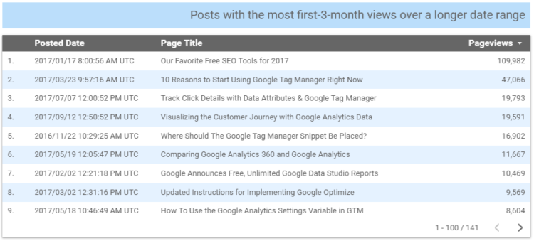
Check the bottom table on Page 2: “First Month Performance” or on Page 3: “First 3 Months Performance”.
The tables on Pages 2 and 3 show you last year by default. This setting gives you a jump-start at the beginning of the year, when there’s not much data to compare.
Bounteous Cohort Blog Example – Numbers Comically Enlarged
Not too surprisingly, last year’s Free SEO Tools post led the pack. With more than 109K pageviews in its first 3 months, this blog post easily exceeded its nearest competitors: posts about Google Tag Manager and the Customer Journey.
How did a specific post trend over its first month?
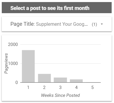
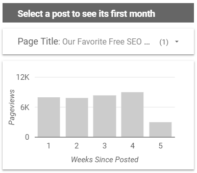
Look at Page 2 and use the Page Title filter. Search and select the post you want, then check the trend shown below the filter, in the bar graph. You may find the post in a filter for either the top or bottom bar graph – the one with the longer date range will have more blog posts to choose from.
Often, the trends for articles or blog posts will peak on the first day or week of publication, and fall off rapidly. Case in point: a post about using Data Studio to supplement your reporting.
More interesting are the trends that continue to have a steady number of views, like the Free SEO Tools post, or trends with intermittent upticks, like the Reasons to Use Google Tag Manager post.
Add context to help explain what you find in the data.
Think about how you can make these reports more helpful for the ultimate stakeholders. Ask questions about the data and answer them before sharing the report, with comments in an email or commentary added to the data studio report.
- What advertising or promotions may have occurred around publication dates for posts that had strong, steady trends or showed later, renewed interest?
- What industry events or national/world events may have influenced your readers and increased views of your content?
- Do certain topics have a more reliable pattern, or generate more views?
More Ways To Explore Your Report
Make use of the filters and date range controls in Data Studio to find out more about your content cohorts. With a little creativity, you can pull even more value from this report! Here are some examples.
Use the Data Studio Filters
- Search for blog posts with the same topic in the title, and see how they did as a group.
- Search for posts with the same publication date, and see how they did as a group.
Change the Date Ranges
- Compare cohorts from this year to last year, or this month to last month, and so forth. In other words, compare cohort data for two shorter (or longer) date ranges, each the same length. Every page shows two tables with a shorter range and a longer range by default – go ahead and change this!
- Compare the cohort trends for two different posts (or two groups of posts) by choosing exactly the same date range for both tables on a page, and then filtering each table with a different title (or topic phrase).
Remember All the Steps!
Remember, your report will be empty until you start collecting the data you need for cohorts.
Get Free Data Studio Template
Step 1: Create four new custom dimensions and collect the data per Jon’s instructions.
Step 2: Download our free report template and make your own copy.
Step 3: ??? OR Follow my Data Studio tips in this post to explore and interpret your data. Find the articles that work best for you, and do more of them.
Step 4: Profit!
If you’re looking for more instructions on how to set up this template, use our recipe!

