Will It Blend? Google Data Studio Rolls Out Data Blending

We knew it was coming, we waited for it, and now it’s finally here! Data blending is in Google Analytics, and it. is. glorious. The nice part about being the upcomer on the data viz scene is that the playbook is already scripted out, the questions become “which features do we prioritize?” and “when?”. The exact way that features are implemented can be drastically different but the underlying principles are the same, like joining data sources or as Data Studio calls it, ‘data blending’.
Data Studio has a couple of tricks up its sleeve, mainly it’s giant network of natively integrated awesome tools. (Check out the BigQuery connector!)
To catch us up, let’s review. Data Studio is the free visualization tool from Google. Built on the Google Drive technology, easy to create, collaborate, and share unlimited reports. We love our Google tools like Google Analytics and Google AdWords, so of course we love to use Data Studio to create great visualizations for our clients and blog readers. Also, of course, one of the best benefits of Data Studio is that we can visualize any data and others have created great ways to bring in non-Google data.
Which brings us back to the business at hand; let’s talk more about data blending and how you can immediately use this feature to make your life easier.
How To Blend Data in Google Data Studio
This feature is supposedly rolling out as of July 10, the day of the Google Marketing Live event. Already people are tweeting about the awesomeness. Check your Data Studio reports to see if you have it by clicking on any report element, then looking at the Data Source portion on the Data pane.
If you have Data Blending, you’ll see an option underneath your Data Source that says “Blend Data.”
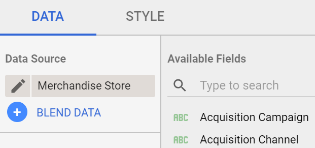
If you don’t see it, don’t panic. Clear your cookies and refresh the page, log back in, and check again. If you still don’t see it, just wait a couple days and hopefully it shows up.
Blending Data Sources on a Common Key
Clicking on the Blend Data button will reveal a lower panel to help make this process easy. It will use your current data source and invite you to Add Another Data Source. The entire premise behind joining data together is to find a common piece of data in both data sets to connect on.
These Join keys don’t need to be named the same in both data sources but need to have the same data. It’s the same concept everywhere – we have two data sources and they have to have something in common for us to join them. Sometimes it’s a Page URL, sometimes it’s a date, or it can be internal user IDs.
For a simple Table element, drag and drop the dimension you want use to join, and then select which metrics you want to appear as columns.
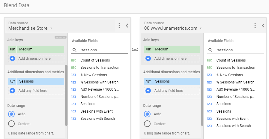
Give your Blended Data Source a name, preferably mentioning both original data sources, then Close the Blend Data panel.
It’s important to note that you’re creating a new data source, that just contains the blended data: the common key and the dimensions and metrics that you selected. You won’t have both full data sources available to you all the time, only the fields that you explicitly put into this joined table, or blended data source.
Combine Charts Together with Data Blending
If you want to combine chart elements, this becomes even easier. If you’ve ever made two chart elements and strategically layered them on top of each other, prepare to be amazed.
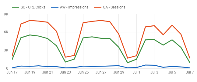
First, pick two or more data sources you’d like to graph together. For instance, if you ever wanted to graph Google Search Console impressions, Google Ads impressions, and Google Analytics Pageviews all in the same graph, now you can.
Start by adding each graph individually. I picked a Search Console data source, a Google AdWords data source, and a Google Analytics source (with greatly modified numbers) and added them all to my report.

Then, to easily combine these charts, hold down CTRL or SHIFT and click on all chart elements, or draw a box around both of them to select all. You can select between 2 and 5 elements. Then, right-click and choose Blend Data.
Data Studio will automatically make you a new blended Data Source, with the common key being the date. It adds this data source to the report and combines these elements into a chart. Voila! (I tweaked my graph to adjust colors and renamed my metrics to make it a little more clear.)
Compare Performance Across Platforms
When you’re using different tools or providing different services to clients, it’s often a staple to be able to see all of these metrics together. Combining data in Excel, Sheets, or other platforms can become tedious or challenging.
At this time, data blending doesn’t seem to support calculations across data sources, but at least we can get them together in the same table, chart, etc. This allows us to see the information at one glance, and (this is a big plus!) easily use the same data and dimension filters to adjust all the elements at the same time.
Note: It will be more important than ever to have consistent naming conventions across your marketing channels. Imagine paid search campaigns that all indicate branded vs non-branded in the campaign name. You can view performance together, or drill down into a specific type of campaign.
Bringing In Personal and Meta Data
Now we’re talking. How about blending Google Analytics data with our Salesforce or our CRM system? Again, this all hinges on getting a common key in both platforms. We’ve written about this extensively. A key to pass between systems is often your Google Analytics client ID. You can store it in Google Analytics as a custom dimension, and pass it into your systems using forms or other mechanisms.
In the example below, I connected a Google Analytics data source with a client ID custom dimension, and a report from my Salesforce account that listed Client IDs and Company Names. Blended together, I can create an easily updatable report showing me which sections of the site companies are visiting, with a drop-down to focus in on a particular company.
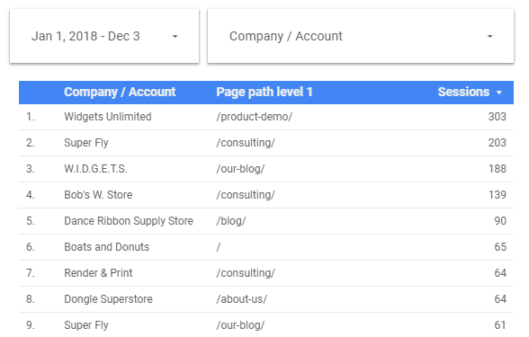
Imagine what else we can do by combining these data sources! Sales regions can be mapped and reported on in aggregate or by sales team member. Conversion data from GA can be viewed alongside Salesforce information. Name, company, purchase history – all together!
Add Context To Performance
Some of the best applications will be taking real-world information and combining it with our online data. Weather data has often been called out as something we can track and combine. In five minutes, I pulled weather history for July, dropped that into a spreadsheet, and joined that with a Google Analytics property.
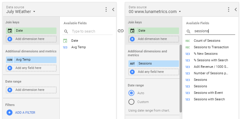
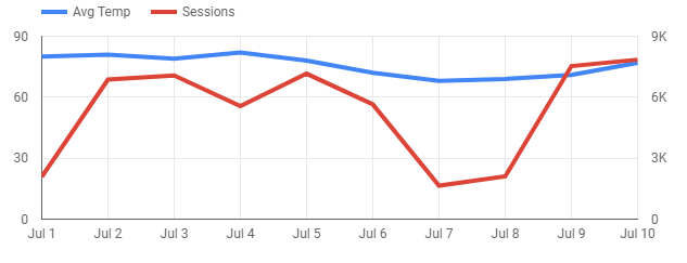
Do these two things have anything in common? From the graph, it’s clear, no, not really. But if you work in a seasonal or outdoor company, perhaps you have a direct need for this. Imagine what other data sources could help provide real-world context when blended together.
A few additional ideas:
- Chart code changes against key site performance metrics.
- Look at calendar or offline events data next to digital conversion rates.
- Track ecommerce performance next to total company sales.
Compare Goals Across Google Analytics Views
Ok, this one’s amazing. Google Analytics has a limit of 20 goals per view. Yikes, ouch. No way around this, this one doesn’t even get better with Google Analytics 360. I’m not sure anyone really needs more than 20 goals, but if you do, a common workaround is to create multiple views and get 20 more goals to play with.
But now, you’ve got a tough reporting challenge – you need to grab data from two or more different views and combine them together in some sort of report. This sounds like a job for data blending! If you have two different GA views with the same info, but different goals, keep going.
- Add one GA View as a data source to your report
- Click Blend Data
- Add the other GA View as another data source
- Combine on a session-level dimension like Source/Medium, Default Channel Grouping, or Landing Page
- Add Goals from each of the data sources
Compare Data Across Google Analytics Properties
Managing multiple websites? Different properties for the same company? Agencies managing multiple clients? It’s easier than ever to combine data to get a holistic report across all of your data needs.
Email Campaigns vs Website Performance
Here’s another great use case – bring in data about a specific campaign and compare open rates and click-through rates in the same table as website performance, goals completed, and Ecommerce performance.
Fun Ideas
We’ve written before about fun use cases for Data Studio, and how our team literally uses for real-world scenarios like health performance, financial monitoring, and more!
“I use Data Studio outside of work to track my small investment portfolio. Blended metrics will save me time spent in spreadsheets and allow me to quickly visualize performance of multiple data sources and better track overall goals.”
Michael Bartholow
Senior Manager, Digital Marketing Strategy
Get Blending!
The power is in your hands – start playing around with blended data and see how it can help you! While a lot of this functionality was available in other platforms or programs, remember that we can now blend data sources with all of the additional benefits of Google Data Studio: easy to create, easy to share, easy to refresh.

