Digital Design is Never Really Done: A Systems‑Oriented Design Approach

You're reviewing your website or app and suddenly, it hits you — your design is outdated. Your numbers aren't doing great. Your content is no longer telling a concise and compelling story. The evidence all points in the same direction — you need a new website. But the minute you start to dig into how that will happen, you become overwhelmed; there are stakeholders, content, processes, and new initiatives to account for. You need a plan.
Great web and app experiences are ones that can grow with your business. The exciting thing about designing for digital is that it is dynamic — we often say that “digital design is never really done.” As part of this belief, we work to create design systems that allow you to grow, optimize, and accommodate for uncertainty. In this post, let’s focus on three tenants of our process that help keep big design projects clear, effective, and dynamic.
- Design audits are foundational: They help us define strong problem sets and align separate stakeholders.
- Strong design is systemic: Focusing on components empowers clients and design teams alike.
- Growth requires flexibility: Businesses are dynamic and your system should reflect that.
Design Audits Are Foundational
When people think of design they often think of the branding, colors, or media. Even with user experience (UX) becoming a more well-known discipline, there is still the pervasive sense that design is just what you see. And it makes sense! Color, look, and feel are the things that make us fall in love with an experience. When these emotional aspects connect to a larger system, our designs start to work for us in exciting, dynamic, and surprising ways.
When auditing an experience, focus on existing components, assets, information architecture, and content. Understanding what’s there helps us move to the next step; if we don’t know what problem we are solving, we can only approximate at solutions. Once all of the parts, players, and needs are identified, we can start the process of creating a robust and usable design system. Additionally, audits offer space for stakeholders to come to a cohesive vision, which is a crucial (and sometimes highly difficult) step in accomplishing any project.
Through this audit, we get an idea of where we’re starting from, and can begin to plan next steps. We might plan to reuse certain components while creating a limited set of new ones or make the call that it’s best to start over and create a new set of more dynamic components. These solutions inform a gap analysis, where we craft a strategy to deliver the design that the business needs.
Strong Design is Systemic
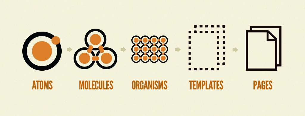
From Brad Frost’s Atomic Design
In 2016, web designer Brad Frost published Atomic Design. In his book, he lays out a system for designing the smallest parts of an interface up to the largest components and templates. While few designers practice atomic design with fundamentalist fervor, the idea that a design system can build on itself while maintaining flexibility is really powerful.
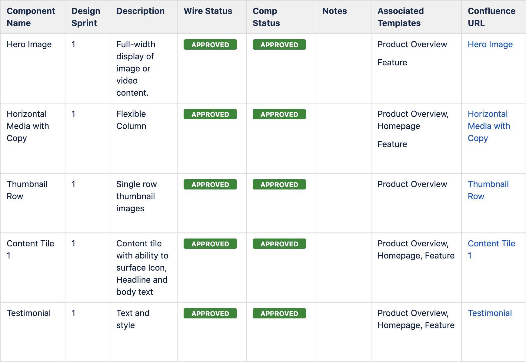
There are many ways in which this system has been interpreted, based on different industries’ contexts and needs. For instance, we take the concept of organisms and create component tables that allow us to define an entire experience by its parts. We then connect these parts to tickets, which contain functional requirements for our developers to ensure that the build process is as clear and efficient as possible.
From a recent redesign project
After we have a strong idea of a project’s needs, we start to break the experience into components and templates. This is where our user interface (UI) designers take the analysis and strategy and craft it into the beginnings of a living style guide.
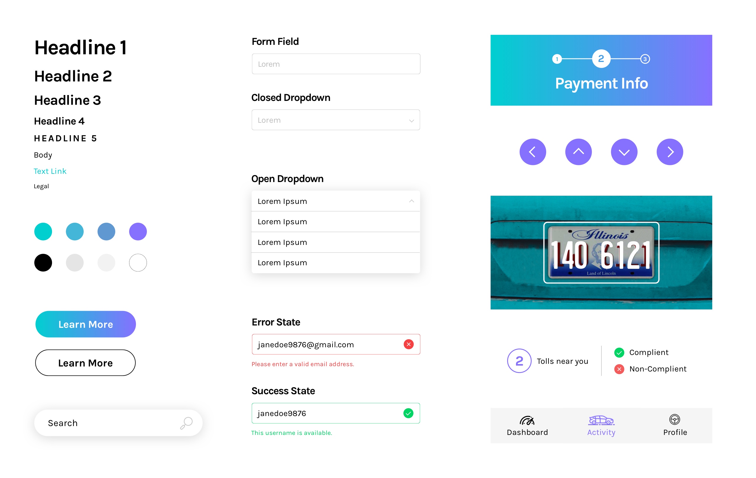
A living style guide, for those unfamiliar, is a reference guide for a team of designers and developers to understand the look and feel of a website and/or application. They help keep the team in sync by housing styles, patterns, color preferences, fonts, and other design elements.
From Peasy style guide
A living style guide ensures that there is governance around type styles, CTAs, colors, iconography, and more. It’s worth noting that design is a process, which is to say that we generally uncover a few unaccounted-for components along the way (that’s the fun of it!). Our team then works with developers and business analysts to craft the requirements and rules that govern each of the designed components. As part of this, we delve into in-depth interaction pressure testing, which can look like user stories, prototyping, user testing, and design iteration. All of this helps make sure that when the client gets the design system in their hands, they don’t have to worry about minute details in the publishing flow.
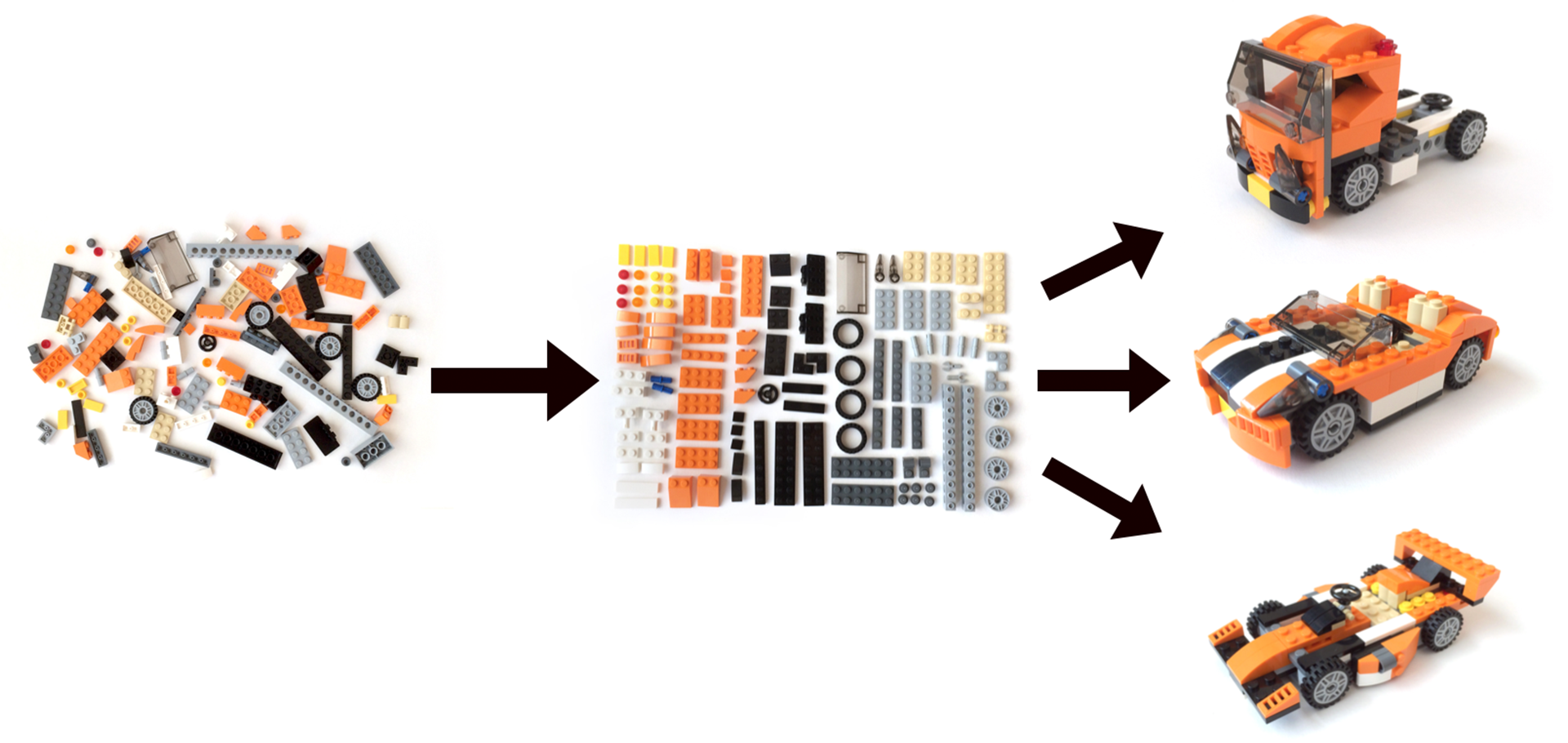
At the end of our design sprints, we’ve created a usable system that elevates the brand, aids conversion, and is flexible enough to accommodate growth and scaling. We like to use the image below to help explain how a design system will work.
From Brad Frost’s Atomic Design
A design system is like a set of Lego blocks; you can arrange them in different configurations to serve different needs. We explain how each car represents a template for a purpose, which has been informed by our strategy and analytics. After we come to a common understanding of our ‘blocks,’ we focus on publishing workflows, content governance, and how the experience might scale.
Growth Requires Flexibility
One major benefit of designing in a systematic way is that when faced with new needs, we don’t need to strip down a series of rigid templates to accomplish the task at hand; instead, we can innovate within our established design language to create a new template (or car, if you’d like to extend the Lego metaphor).
As with most things, this requires some balance. In a recent post from Twitter engineers Katie Sievert and Jon Koon, they explain:
"Much like the universe itself, as client code matures and grows, there is a natural inclination towards entropy. We like to call this the ‘why don’t we just…’ fallacy. ‘Why don’t we just add a special prop?’ ‘Why don’t we just fork that component with some tweaks?’ ‘Why don’t we just make a one-off component for this custom UI logic?’”
We see this scenario often, but planning ahead in design sprints can ensure that the design has the necessary room for growth. For instance, if we know a client will be focusing on producing a large amount of video content, but it will not be available at launch, we will still design a video component, and ensure that existing components will be able to convey all necessary content — by creating this kind of flexible system, we create something that not only works now, but provides insurance for the future.
Organizational Principles
Each system and situation is unique. When designing for complex digital landscapes, lead with these organizational principles, but allow yourselves the space to explore innovation and nuance. And as always, if you still feel totally overwhelmed by your big redesign or launch, let’s start talking. We’re happy to handle the details.


