Experience Audits: Identifying Usability, Content, and Task Flow Opportunities

One day, you find yourself looking over your digital experience, trying to find something specific you know is on your website...somewhere. All of a sudden, it hits you.
This design isn’t working for you. It isn’t working for your users. And you’re starting to notice the effects on your business. If any of this feels familiar, it’s likely time for an experience audit!
What Is an Experience Audit?
What we say when we want to sound brainy: An experience audit is a qualitative review that helps us analyze an experience from the user’s perspective as they try to accomplish their goals. Through an experience audit, we can quickly identify potential usability issues, content gaps, and inefficient task flows.
What we say when we want to speak plainly: It’s a quick way to figure out what’s wrong with a website or mobile app.
Conducting Experience Audits
There’s no one way to conduct experience audits. Rather than being prescriptive, we tackle them as individual efforts informed by the context of the project or intended audience. We employ user observation, expert reviews, and video diaries as principal methods in our practice — all great for identifying issues and opportunities for improvement.
User Observation
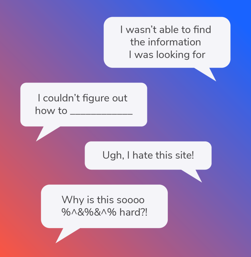
Observing actual users is a powerful way to understand what they are thinking as they flow through an experience. It’s also an awesome way to get sassy verbatims and “OMG” video clips.
Observing users as they try to complete a task helps us pinpoint opportunities for a simple user flow; it allows us to quickly identify experience gaps, usability issues, and blockers. It also helps that users often tell us EXACTLY what they are thinking. User observation method is an effective way to quickly demystify quantitative observations.
For example, if you notice in your analytics that your users are dropping off mid-checkout flow, user observation can help us qualitatively understand why that’s happening, and what issues they may be encountering. Is your billing collection form in a strange order? Is their cart inaccurate? Does their coupon code not work? Were they unable to remove an item? Is the confirm button difficult to locate? These kinds of frustrations add texture and depth to the issues we find in quantitative audits, giving them the kind of invaluable context that creates a full picture.
Expert Reviews
Who says spreadsheets don’t spark joy? Not us!
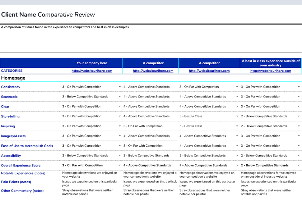
Expert reviews are a more intense review of an entire user experience. They almost always start with a list (usually in a spreadsheet, YAY) of observations including, but not limited to, issues around information architecture, wayfinding, content, usability and accessibility issues, and visual design.
Another layer of this type of review is incorporating observations of competitive and/or comparative experiences. Competitive and comparative reviews involve looking at usability issues in the experience and comparing how other companies solve similar issues. Direct competitors can be scanned for this information, but we also find best-in-class examples, sometimes outside of the industry, to give us a fresh perspective on ways to solve the issue. This can be a light scan for examples or a comprehensive scoring exercise for three to five competitors.
We love using spreadsheets for this because it makes the comparisons easily scannable, and they’re a great way to organize your thoughts succinctly. Our competitive/comparative reviews usually end up looking something like this:
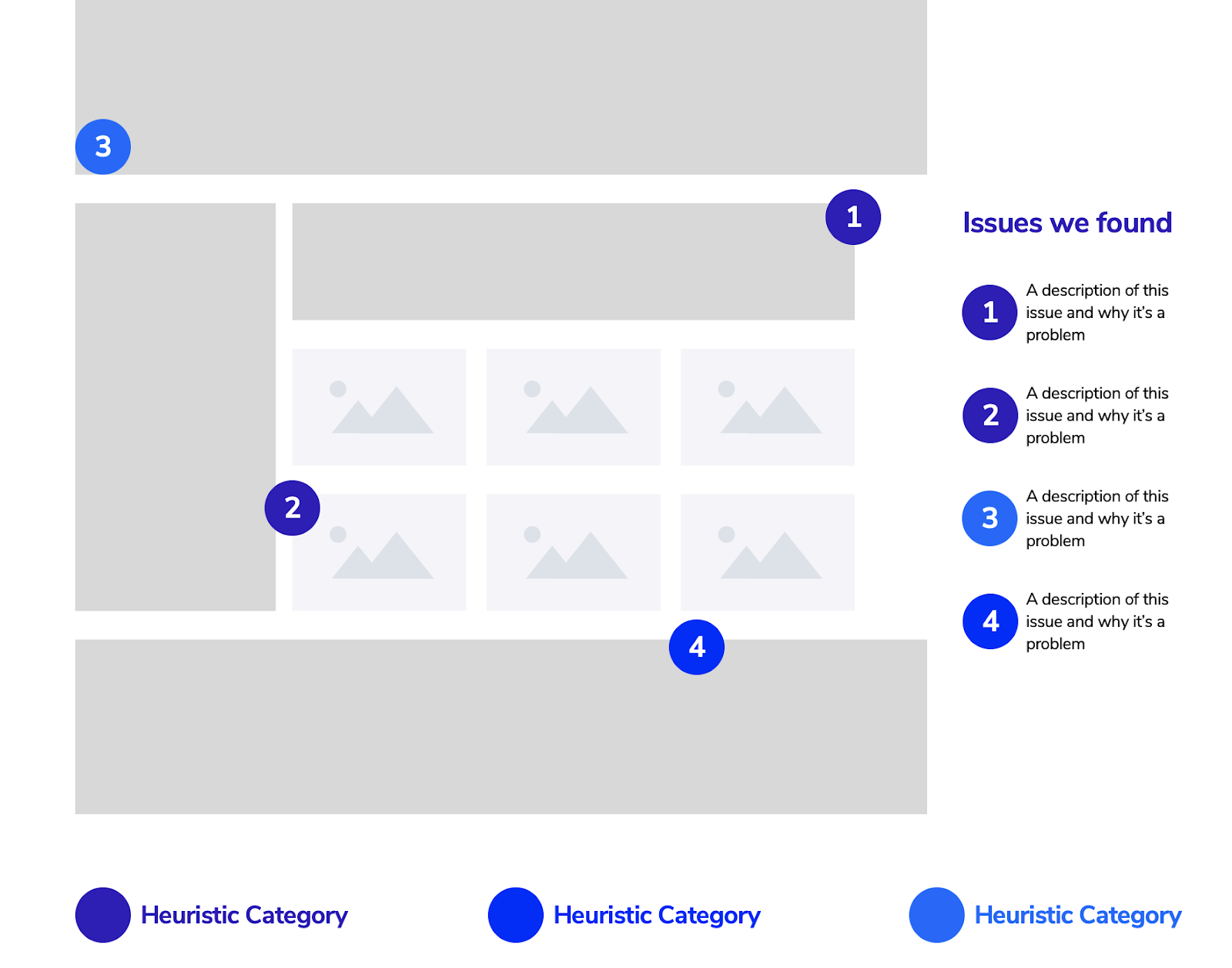
Because not everyone finds scanning through spreadsheets of observations as fun as we do, we always translate them into a concise executive summary with lots of annotated examples and prioritized recommendations.
Our recommendation for these is to gather as many screenshots of issues as you can find. Don’t worry about sorting them into any kinds of categories at first; just observe and capture what you see. Once you have a decent number of findings (anywhere between 20 and 30), start to organize them. We find it helpful to organize by common user issues and heuristics, such as recognition over recall, consistency and standards, and efficiency of use.
Once you’ve assigned each category to your screenshots, start to pare them down by the best examples of each heuristic violation. Annotate your screenshots and explain why this is an issue to be resolved. Then look to your competitor audit and show examples of how these things could be improved.
Video Diary
Sometimes the best way to illustrate experience issues is through a reenactment of a user experience. It’s just like reality tv — totally scripted and very engrossing.
Drawing on examples taken from user observations or expert reviews, video diaries show how issues can pile up and create user friction and frustration. They act almost as a dramatization, with a heavy of, “There has to be a better way!” subtext. We find that video diaries are impactful, especially when we are unable to present our findings in person.
To create a video diary, we take our findings, put them in a user flow order, open up Quicktime screen recording, and record ourselves as ultra-confused users who are trying to complete a task but keep running into issues. Going through the user flow as if we are someone experiencing every single problem we’ve observed is a great summary of our expert review and user observations: it’s one thing to see spreadsheets and marked up audits, it’s another completely to watch a sample user run into issues left and right while trying to complete a task or flow.
Qualitative Assessments
But wait, there’s more!
When experience audits are paired with qualitative assessments from our Analytics & Insights team, magic happens! This comprehensive left-brain + right-brain approach gives our team the best insight into how to optimize the experience. As part of a test and learn optimization program, our teams work closely together to prioritize and roadmap improvements and experiments.
Another reason that experience audits rock is that they help us get a jump-start on many of the other activities we do throughout our discovery and design process. This is because they both inform and complement many user-centered activities, including stakeholder interviews, customer interviews, persona creation, journey mapping, experience strategies, design requirements, and formal user testing.
Experience Audits Lead to Great Insights
Experience audits are a great way to gain insights that help immediately and support other findings. They’re one of the first things we do at the start of any new client engagement. It’s also something we almost always do when we’re engaging a new potential client, because they help us quickly understand them and get a sense of the possibilities for their digital experience.
Whether they’re quick-and-dirty or comprehensive and detailed, experience audits are a foundational input into any design strategy and approach. We dare you to audit an experience and not leave satisfied with the joy they bring to both your clients and of course, to you.


