Opening Doors with Great Omnichannel Retail Experiences
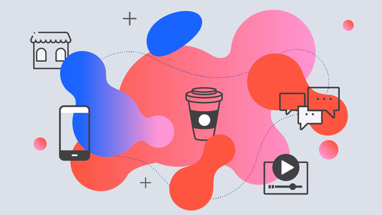
Omnichannel, or integrated retail, is about creating a single experience across all ways a customer might interact with your organization; the website dovetails with the bus stop poster that jives with the in-store kiosk that speaks the same language as the customer support representative sending updates to you via their app. Omnichannel experiences engender trust because they’re stable and consistent; I know what this company is about and I don’t have to worry about curveballs.
That trust isn’t accidental — it’s earned. So how can we, as empathic designers and strategists, create a scenario in which your needs are not only met but anticipated? Much like a gracious host, it’s our job to open the door right as you walk up the stairs: no matter what the stairs are made of, where the door is located, or how you arrived there in the first place.
But, omnichannel doesn’t mean omnipresent. It’s important to identify those critical touch and pain points to engage with the right message at the right time, matching the cadence of the customer journey with the voice and tone of your brand, and smoothing the way with pixel-perfect interactions. All these points come together to create a holistic experience that is smooth and all-encompassing, but never overwhelming.
Moving Beyond Screens
As designers, we excel at sweating the details. On any given day, you might hear, “...but are we accounting for the return user here?” or, “That corner radius looks suspiciously 4px, not 5.” With that level of focus, it’s easy to look through the big picture to ensure the fit and finish are up to snuff.
But, it’s also our responsibility to remember the experience in Experience Design extends beyond the individual screens of a website or app and into the customer experience of a brand. Luckily, much like raising your eyes above the lip of your laptop to view the coffee shop before you, that laser can be refocused toward the overarching, multichannel experience.
So, what makes a great omnichannel experience? Like most subjects, it’s easier to explain with examples contributed by members of XD team: below are some of our favorites, and why they’ve earned our respect as great examples of omnichannel done right. These examples have gone beyond a good experience — they’ve brought the digital and tangible world together in a way that evolved customers’ expectations of what a brand can be.
Blue Bottle Coffee eCommerce Website ☕
|
Marly Schoen Epstein, Lead UX Designer A UX designer who thrives on working in a team environment to create lasting user experiences and enjoys knowing where her coffee is sourced from. |
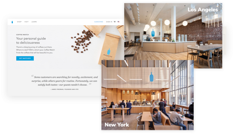
Blue Bottle Coffee opened in the early 2000s with a historic vow to only sell coffee less than 48 hours out of the roaster. Fifteen years later, it has grown to a network of cafes across the U.S., Japan, and Korea. On top of their stores, they are a $700 million eCommerce business.
How did they get here? When Blue Bottle Coffee launched their eCommerce business, there were few customers willing to buy their coffee online. Customers who had never stepped foot in an actual Blue Bottle coffee shop weren’t educated on how or what to buy. Conversely, in-store customers were greeted by well-trained and knowledgeable baristas who would guide them to a fresh, roasted cup of coffee that perfectly met their needs.
Blue Bottle realized this gap in a Google design sprint, and concluded that in order to sell to customers online they needed to educate them about their cup of joe just like they would in-store. Using in-depth brewing guides, educational videos, a personal guided quiz to find your coffee match, and hosting events and classes in different areas, Blue Bottle was able to build their eCommerce business.
But it didn’t stop there. Blue Bottle is the first to come up for many Google search terms around coffee and how to brew coffee – a sign of a thoughtful content and marketing strategy – and they even started their very own customized subscription services for users that can’t get enough.
Today, Blue Bottle stores and wholesale accounts combined are in the $15 million to $20 million range and plan to grow 70 percent or so a year. When you walk into a Blue Bottle Coffee store or visit their website, you get the same type of feeling: the anticipation and excitement for that cup of coffee just the way you like it. And let me tell you, there is nothing like that first sip.
Blue Bottle drew on user research and digital marketing services to translate the success of their in-store experiences to an eCommerce platform.
Starbucks Mobile App📱
|
Hannah Green, Lead Designer Leveraging experience in visual design, experience design, advertising, and brand, Hannah leads digital engagements with a passion fueled by her talented team, love for the art of design, and her love of caffeine! |
Starbucks rolled out its app in 2011. Within less than a year, over 26 million transactions took place. Since then, the company has more than doubled its annual revenue to date. For years, I used the app nearly every day, only stopping when my commute changed. I was already a frequent (and happy) Starbucks customer. I appreciated the plentiful roast options, the friendly faces, how employees would verify the “h” at the end of “Hannah.” What Starbucks couldn’t always offer me was speed.
The mobile app changed that. With order ahead, I was able to place my somewhat picky order — a grande iced coffee, unsweetened, in a venti cup with a splash of skim and one Stevia — while on the train in three taps, adding only 45 seconds to my commute.
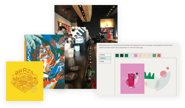
The language used throughout the app experience to onboard, confirm orders, and communicate notifications follows the same warm and concise verbiage used by baristas in store. Microinteractions validate transactions and reiterate the light, uplifting tone.
The visuals update seasonally in parallel with the brick and mortar stores, and the consistency of the dedicated order-ahead pickup area ensures that I know when and where to pick up my beverage. As a side note, Starbucks continues to expand and evolve their brand expression in a way that makes visual designers drool.
Southwest Mobile App and Website ✈️
|
Marly Schoen Epstein, Lead UX Designer As a frequent-flier, in air and on the ground experience matters to Marly. |
Southwest is well known for its transparent communication and superior customer service. From rare flight delays and cancellations, to free checked luggage and champagne for the bride-to-be, their in-person customer service is notable.
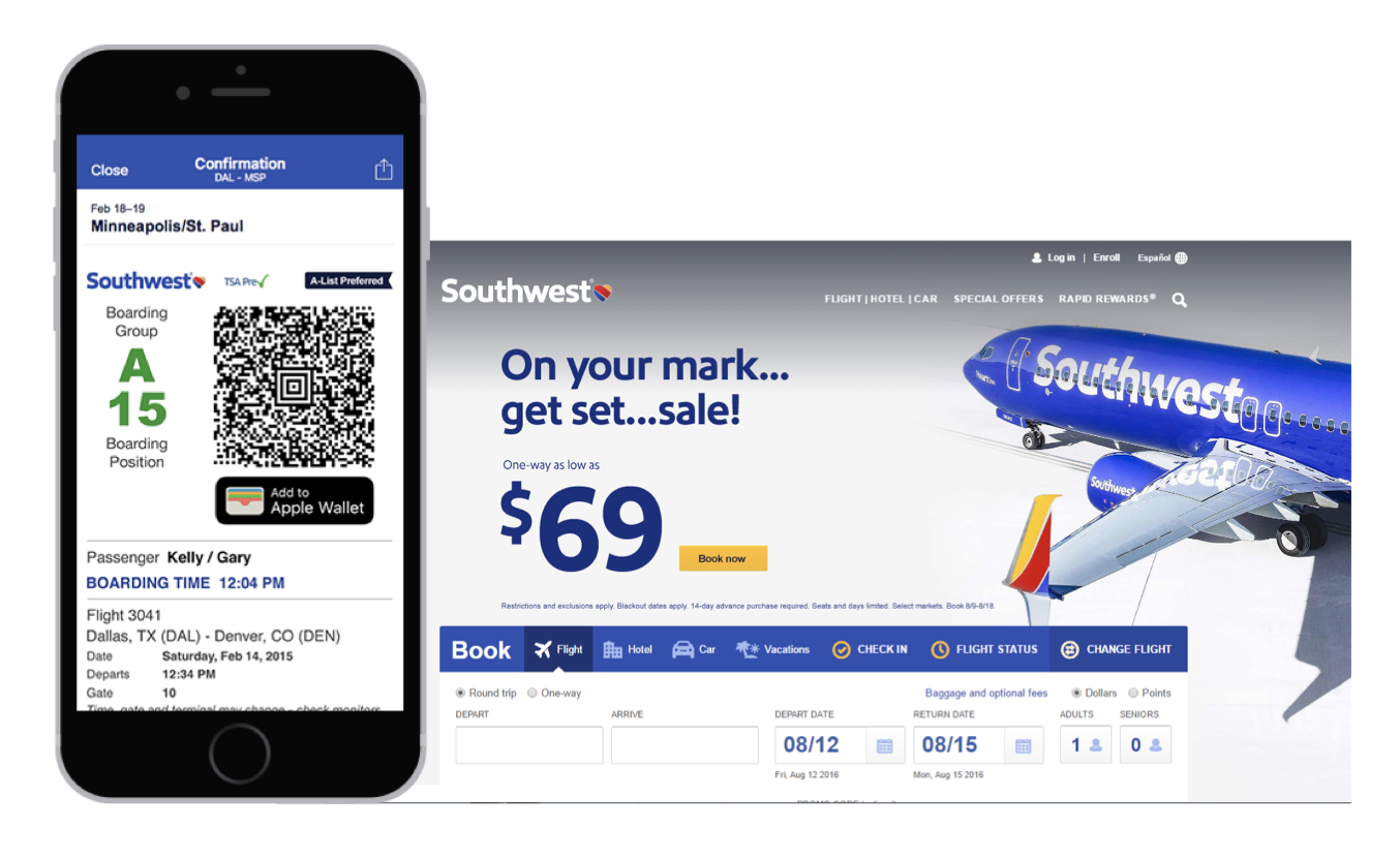
But it doesn’t stop there. With their mobile application and website, in-flight customers are the first to know of any delay or cancellation, most of the time even before the gate agents announce it. I had first-hand experience with this convenience: when I was waiting at the gate, I received a notification via their app about my flight cancellation. I re-booked myself on the next flight directly through the app, skipped the in-person long lines, and got the flight before it was sold out — even before most other passengers even knew it was canceled. This cross-bridge of being somewhere physically but using digital means to skip ahead is one of the many reasons why Southwest is so successful.
Much like visual design, people might not notice a great omnichannel experience, but they nearly always recognize a poor one. In those caffeine-deprived, delayed flight moments, the interactions a customer has with your organization, active and inactive, digitally or in person, can quite literally change the course of their day.
Design Should Begin in a Personal Space
As designers, we sit in a position that allows us to reach customers in thoughtful, personal ways that also drive revenue and build brand trust. The design process too should begin in a personal place. Think about what small details in products, services, or spaces make you happy. Designing for the omnichannel experience is merely a practice in extending these hospitable, human elements to the digital realm.

