Delivering Creative Brand Experiences Starts at Home

John Anthony and Amanda Ruzin hosted a webinar where they shared how to Get the Sizzle with the Steak; how to blend the efficiency and scalability of digital experience platforms like Adobe Experience Manager (AEM) with the creativity that a well-honed design team provides – ultimately giving all parties involved a positive experience. They covered several rich topics, which we will explore in-depth here.
Watch Our On-Demand Webinar: Get the Sizzle With the Steak

Debunking Common DXP Myths
But first, let’s clear up some common myths around digital experience platforms, or DXPs. We sometimes hear that DXPs are creatively restrictive, expensive, and difficult to update and maintain within the context of a robust design system. But based on our experience, these concerns tend to be misconceptions.
More often than not, it’s the design, implementation, workflow, or lack of planning that’s contributing to those issues — all of which can be resolved. The six key principles below can help you prevent those pitfalls from happening while you’re trying to create amazing brand experiences.
Principle 1: Understand the Ecosystem
Brand experiences that focus solely on the customer and individual touchpoints are a thing of the past. Expectations have changed a lot, and the site visitor’s experience is going to be directly impacted by the freedom and power that the content authors are provided.
We need to start looking at experiences holistically, including external AND internal users. If the content author, for instance, isn't ultimately comfortable with the DXP's content editing user interface (UI) or the workflows built around it, they may come to eschew your system.
Our Pro Tip: The content author impacts the experience as much as and sometimes more than design or technology.
Principle 2: Focus on the Moments that Matter
Our assumption is that not every part of a customer’s journey can be meticulously controlled nor designed. Our research leads us to the moments that matter – those stops along the way that will really make a difference for a person. It might be the moment an automated telephone system uses your correct pronouns, or when a restaurant kiosk pulls up your last order in the event you’d like to quickly reorder, or a website that feels like it was made just for you.
Timely, relevant content is powerful: understanding what that looks like means focusing on those important moments. To do this, we recommend taking a data and insight-driven approach, so you know you’re spending your time and efforts in the right place, and that you will change the experience in a meaningful way.
Our Pro Tip: Force yourself to choose your moments before project kickoff, using persona identification and journey mapping exercises, as well as conducting an experience audit. This will help everyone start the project with a clear understanding of what will ultimately define success.
Principle 3: Think in Systems to Build Products at Scale
Once a project starts, you need to think about the reusability and scalability of what you’re creating. You can no longer think in pages and individual use cases for components and content — you need to think in design systems. With every element and every component you design, ask yourself: how are you going to reuse these throughout your experience, and how are they going to grow with you in the future?
Likewise, think about how content will be used across the whole ecosystem: Not just on a web page, but in a voice app, chatbot, etc. We recommend using a living style guide to help with the component-based design process.
Living style guides are live code that are always up-to-date with current branding, can be used to prototype changes quickly, and allow you to see what components will look like responding on a variety of different device sizes. Ultimately, they’ll save a lot of time and effort in the long run.
Our Pro Tip: Living style guides are worth the investment. And if you’re upgrading, take the time to audit your components. There are probably redundancies and discrepancies, and this is a good time to consolidate.
Principle 4: Plan for Your Sizzle
The moments that matter are the moments where you may want to put in more time and effort. This is where you can lean on your established design system, along with out-of-the-box capabilities of your DXP, to take care of the easy decisions.
For example, you may be using a series of components that can be assembled into a landing page in lieu of a microsite rollout. Let your design system handle 80 percent of the work, so you can spend your valuable time and effort on that remaining 20 percent – the sizzle that will make a lasting impression, even if it falls out of the capabilities of your design system. Work with your technology team to understand what your DXP can do, and how you can push the boundaries.
Our Pro Tip: Leverage your DXP and its core capabilities, but don’t be afraid to invest in high-impact moments.
Principle 5: Make a Minimum Loveable Product
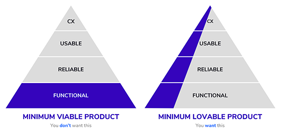
You’ve probably heard the term “MVP,” Minimum Viable Product. Odds are good, then, that you have a very clear idea of what that looks like: a bare-bones experience that focuses on function and sacrifices important brand or experience moments. With that in mind, we encourage the goal of an MLP – a Minimum Loveable Product.
An MLP addresses a tall slice of the cake instead of just one layer like an MVP does. Not only that, but this holistic approach hits every area of focus and builds over time. It’s a recommended compromise between launching with a core set of functions, while not compromising the experience at launch. The alternative generally leaves people wanting more, with key features and functionality pushed to a “Phase 2” that never happens.
Our Pro Tip: Focus on an experience that goes beyond the functional by bringing the right people together early on to define the project vision. Don’t leave out content strategy, UI, UX, or the unsung hero of many projects, the Business Analyst (BA)!
Principle 6: Empower Your Team
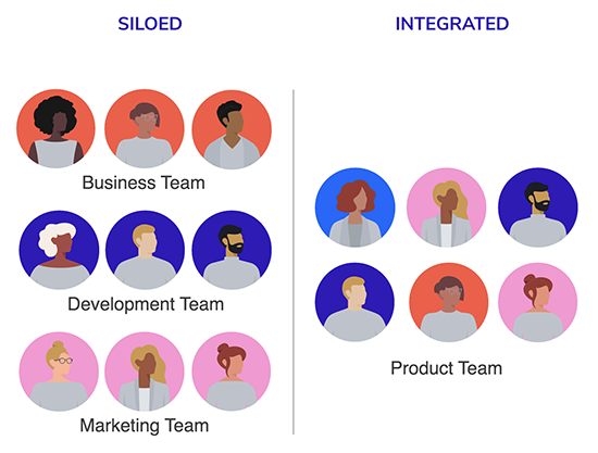
Our last and most important point isn’t something digital – it’s human. It’s to empower your team. The best solutions happen when you bring people together across disciplines; in part because once your brand is out there, everyone who contributes to your digital experience is a brand steward. By bringing people into the fold early, we see efficiencies through clearer workflows, fresher content, and an aligned understanding of pain points across the board.
Our Pro Tip: Content authors, business owners, and architects need to be part of the requirements gathering and design. Ask questions of the people who are involved in this project to gain an understanding of what they need – including both your internal people and end users – and work with them to ensure buy-in.
DXPs Bring Brands Forward
At first, bringing a DXP into your organization may seem daunting, and antithetical to the brand experience and story you’ve worked so hard to define. But, when you take these principles into consideration and focus on people first, a robust DXP can be one of your organization’s most valuable assets.


