Using Community Visualizations in Google Data Studio
Google Data Studio has continued to grow bigger and better since its launch in 2016, fueled by an ever-growing community of contributors, evangelists, and excited users. New features and bug fixes are released a few times each month, with advancements like conditional formatting, pivot tables, and dashboard themes exciting the masses and opening the door for branded and easy-to-understand visualizations. Oh, and if you’ve missed it thus far, it’s free.
Data Studio comes with a set of connectors to other Google products (like Google Analytics, Google Search Console, and more) as well as a host of Partner Connectors that have been submitted and approved, which allows you to connect easily to pretty much any data source that you'd like. Even if a connector doesn't exist for you yet, there's an API for that to make the possibilities even greater. Speaking of APIs, Data Studio has now blown the door open for a new world of advanced visualizations.
Google has added this flexibility through its community program, allowing individuals and companies to contribute Community Visualizations. With this new library, the opportunities for highly interactive data elements are as expansive as the tools it involves, JavaScript and CSS.
These are structured, documented ways to bring in your own data or create your own visualizations, and if willing, share them with the larger Data Studio community. It’s an exciting way to allow the tool to continue to grow organically, at a pace that can move faster than the formal product review and additions at Google.
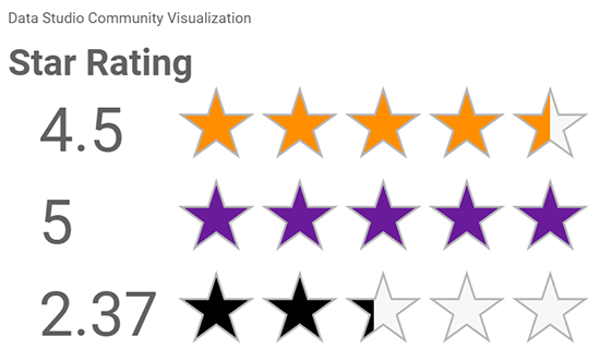
With that in mind, our teams at Bounteous have tackled Community Visualizations in a few different ways. Our Google Data Studio course is offered a few times a year and talks about adding and using custom visualizations. We've held company-wide hackathons since 2015 and last year one of our teams created and shared a Custom Visualization internally, learning about the process and sharing knowledge. And as part of the recent batch of community visualizations that were added, we’ve contributed a Star Rating Visualization to the publicly available Custom Visualization gallery.
We’ve packaged up our beginner guidelines to using custom visualizations below.
What Exactly is a Google Data Studio Community Visualization?
Community Visualizations are made by volunteers to help grow the available pool of options to highlight and showcase data with a Data Studio dashboard. Anyone can contribute, though there are detailed instructions to follow and a review process to get accepted into the public gallery. Most visualizations build on a visualization library, for example, D3.js, Plotly.js, etc.
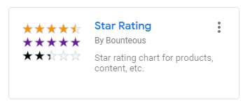
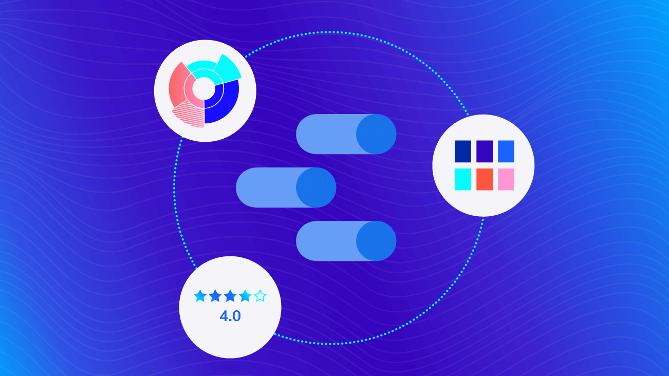
Our Google Cloud Platform Lead, Amanda Schroeder, recently created and shared a Star Rating visualization, helpful for turning information like reviews and ratings into visual elements in a dashboard, adding some opinion or preference data to observational data.
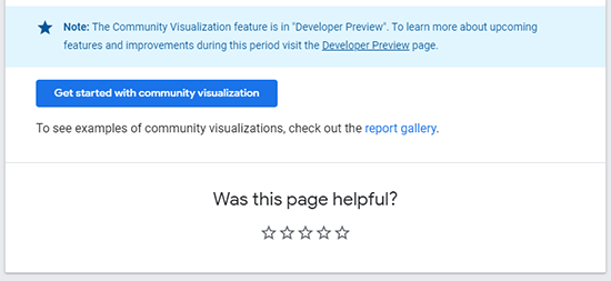
This information might come from an external source, like a Glassdoor ranking, or perhaps a poll on your site that can be tracked with Google Analytics. Take Google’s Data Studio developer site, for example, which allows readers to rank the quality of help content. This type of information is typically stored and reported ... somewhere... but wouldn't it be great to see that in our shared Data Studio report?
Each Community Visualization typically has a sample report, with examples of the visualization in action and instructions for adding it to your own report. Take a look at the Star Rating visualization example and instructions.
These visualizations often have some customizable settings, like the data source and colors, but might be more limited in the types of data they can work with or the settings available. They may not be updated as frequently, since they’re largely contributed by volunteers and are not a formal part of Data Studio.
Using Community Visualizations in Data Studio
Not interested in popping the hood and taking a stab at coding? That's where the "community" aspect comes into play.
As you’re planning out your next dashboard or if you’re just looking for some practice, take a look at the Community Visualization gallery to get an idea for what types of visualizations are available. Make sure to check back periodically, as the contributing community grows and new visualizations are released.
Adding a Community Visualization has changed recently, so there are a few options.
Add Featured, Partner, and Custom Visualizations
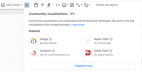
The easiest way to add a Community Visualization element is to click on the Community Visualization button on the Data Studio Edit toolbar as seen below:
There are few options listed here, and you can easily just click on one to add it! If you don't see what you want or would like to add a custom one, then click the option to +Explore more.
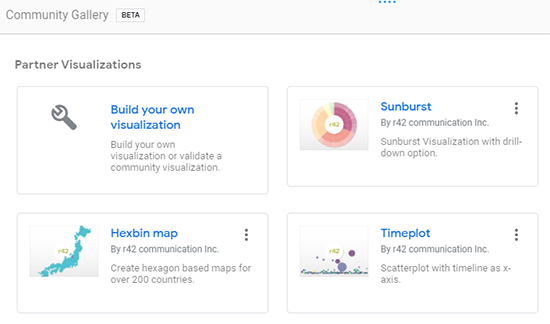
This will display the Community Gallery pane, which also shows a select group of visualizations. Lots of great options here, explore and grab anything you want!
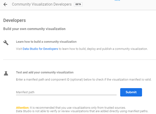
Still not seeing what you want? Click the Build your own visualization button to learn more about building your own, or importantly, adding one that someone else has built.
Here, you can import any custom visualization just by pasting in what's called a manifest path. This looks like a URL, but is used to pull up the Visualization preview, which can then be added to your report. You might find a Manifest path in the Community Gallery linked above, you might get sent a path in an email, or you might find one in a blog post like this one. In our case, you can add our Star Review visualization by using the following manifest path:
Manifest Path: gs://ds_com_vis_star_rating/
Of course, let's remind everyone that it is important to only add visualizations that you trust or that you're making and previewing yourself.
Enabling Data Access to Community Visualizations
Now that you’ve added the visualization to your dashboard, it’s time to add a data source.
Chances are this might take a little tweaking to get it to work right away. You have to ensure that the data source you’re using to fuel the visualization can also communicate with these resources.
Open up the data source properties for the particular data source that you’re trying to use.
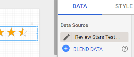
The pencil is your clue that you’re an owner of the data source.
NOTE: If you don’t see administrator-level permissions of the data source, learn more about data source credentials in Data Studio.
To do this, you’ll need to enable Community Visualization access within the data source:
1. Click into a Visualization and add a data source
2. Confirm ownership of the data source
a. In our example, our data source is a Google Sheet
b. Verify ownership by looking for the pencil icon next to your data source
3. Edit the data source
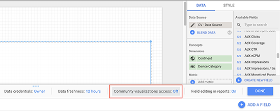
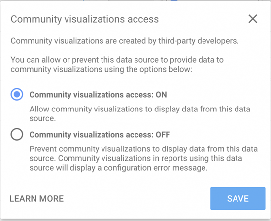
4. Look for the Community Visualizations on/off switch
5. Turn Community visualizations access to ON > Save
The Future of Data Studio Custom Visualizations
As Google Data Studio usage continues to expand, it’s exciting to see adoption and contributions coming from different industries and communities. While it’s an easy win for digital marketers and agencies who are used to delivering dashboards and reports on a regular basis, the ease of use and intuitive interface are attracting industries and users who may never have attempted to use a visualization tool before.
Custom Visualizations are a small but powerful part of meeting the goals of dashboard creators, filling in the gaps of default reporting tools with new and interesting visualizations. A thriving and vibrant community of contributors helps with both attracting new users and evangelizing changes to existing or previous users.
Not seeing the chart you need, or interested in a new challenge? Consider creating and sharing a new visualization! We highly recommend working through the Codelab example, Create Custom Javascript Visualizations in Data Studio, as a way to learn both Data Studio terminology and structure and to have practical hands-on experience.
As the Community Visualization adoption grows, we at Bounteous are excited to see the continuous dedication to elevating reports into meaningful, data-driven narratives.
