Explore Depths of Your Data in Google Analytics 4 Properties’ Analysis Tools
Google Analytics 4 Properties (formerly App + Web) is one of the biggest innovations in the Google cosmos to be released in recent years. An equally recent release, that has our team just as excited, are the new Analysis Tools. Not only do these tools contain new reporting elements, but they’re also free for all users!
Not familiar with Google Analytics 4 Properties? Then take a look at Unified Data With Google Analytics 4 Properties written by my colleague Amanda Schroeder. She gives an in-depth introduction to the new tool. Google put a lot of engineering power into the Analysis area, especially in the Path analysis feature. The best part, in my opinion, is the powerful Analysis Tools and how they can help you explore the true depth of your data. Hopefully, after reading, you’ll be feeling just as enthusiastic about these news tools as I am!
The Background
In Google Analytics (GA 360) today, all users have access to custom reports. If you’re a user of GA360, you’ve already been exposed to the Analysis Beta reporting feature. However, you won’t find this menu item in Google Analytics 4 Properties. This area has been integrated into the Analysis Tools, and it’s now available for first-time users of the free version of Google Analytics 4 Properties. They can use the analysis area, as well. For this reason, everyone is invited to play around with the new reports and benefit from the variety.
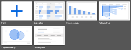
The area of analysis currently covers five different techniques: Exploration, User explorer, Funnel analysis, Path analysis, and Segment overlap. We’re going to take a detailed look at the individual techniques and give practical examples. But first, we’ll take a look at the general structure of Analysis Tools.
The Analysis Tool is part of the standard reports and a fixed element of the left navigation. Quite far to the bottom, you will find the "Explore" area. This is the home of the Analysis section and contains all reports. Within the Google Analytics 4 Properties Analysis Tool, we can find our dimensions, metrics, and segments underneath the category of variables. This is a new term for many of us, but really these are the pieces that we'll use to build each one of our report types.
What Data Are We Looking At?
Before we get started with the Analysis Tools, we should make sure we’re all on the same page. So, what are we dealing with in Google Analytics 4 Properties? First of all, we have to keep in mind that Google Analytics 4 Properties collects, processes, and stores data in a completely different way than Universal Analytics. Universal Analytics' data collection is based on users, sessions, and hits. Whereas, Google Analytics 4 Properties uses an event-based data model which originated in Google Analytics for Firebase. The new Google Analytics 4 Properties use the benefits of Google Analytics for Firebase, as well as providing access for all types of websites—not just apps.
The focus of the new Google Analytics 4 Properties lies in the integration of various data streams into a single property. As a result, customers' cross-platform movements can be more fully understood. One property can manage up to 50 data streams and comes with additional dimensions and metrics.
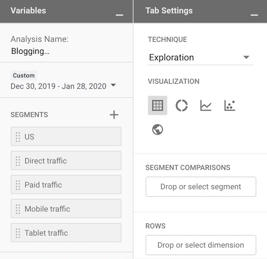
With that in mind, let’s take a look at the fundamentals of the Analysis Area. All five reports in the Analytics Area (called techniques) have the same structure. As soon as you open a new report, there are two columns on the left side with variables and tab settings. You can minimize both columns for more visualization space. This is followed by a pre-selection of segments, dimensions, and metrics. These can be added to the analysis by dragging and dropping. However, you can exchange individual elements of the variable at any time.
At this point, it’s already quite easy to make customizations. For example, while debugging it can be helpful to focus on a certain browser when a specific event happens on the website. The segment can then be adapted to the extent that it only includes a specific browser version within the same event. You can then modify the segment and even select the condition scoping.
An analysis can contain multiple reports organized in tabs. All reports within the analysis can be exported and shared. The next two features are especially useful for beginners: On one hand, you can undo or redo individual steps. On the other hand, you can create duplicates of the tabs and thereby save work.
All in all, the analysis area resembles Google Data Studio more than standard Google Analytics reports. The sophistication of possible analyses appears at first glance to be broadly diversified. Let us dive into the depths of the individual techniques.
Exploration Reports in Google Analytics 4 Properties
At first, the Exploration report of the Analysis Area will probably receive the most attention in Google Analytics 4 Properties. The report replaces the custom reports we know from the “Customization” tab in Universal Analytics and it could be used as a starting point for individual analyses. Compared to the custom reports known from Universal Analytics, the Google Analytics 4 Properties exploration technique surpasses them in two areas in particular: depth and usability.
The limit of dimensions is higher and therefore the variety of combinations between dimensions and metrics is broader than in the custom reports. Up to five dimensions can be shown as rows in the table. To recall, standard reports in Universal Analytics only contain up to two dimensions. The real advantage lies in the customization possibilities. It’s extremely flexible in customizing its layout. Over 20 options exist to individualize and refine this analysis technique.
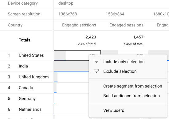
As you can see on the screenshot, the table is interactive. You can restrict or exclude a section of the table with a right mouse click. A segment or audience can also be created at this point. Thanks to the visible data reference, the segment can be understood visually. A step towards further analysis is the menu item "View users," which takes you to the User explorer of the respective data point.
When it comes to usability, the exploration technique offers much higher user-friendliness than the standard reports in Universal Analytics. Variables can be added, changed, or removed by dragging and dropping on the same screen. It also reduces response time and allows you to see the changes without delay. Especially with large amounts of data, many reports load quite slowly in Universal Analytics.
A new aspect within Google Analytics 4 Properties is the detection of anomalies in the explorative analysis. For this purpose, you will need to create a line chart. The comparison period must be large enough to provide a sufficient data basis. It may range from one to seven days. The line graph is also interactive and highlights the anomalies with a special label.
The screenshot shows a lower Actual number than Expected. This can also be the first step for further investigations. Google Analytics uses a specific statistical model to display the forecast. Modifications with the p-value thresholds are also possible. In other words, the limit for statistical significance can be adjusted for the individual use case. Google refers to this part of anomaly detection as "sensitivity."
User Explorer in Google Analytics 4 Properties
We already know the user explorer in a similar form from the existing reports. The User Explorer in Universal Analytics can be found in Audience Reports. But some changes have been incorporated into the Google Analytics 4 Properties user explorer. As you might expect, the customization options are much broader. In the user explorer of a standard Google Analytics view, there are pre-defined metrics in the report. Segments and filters can be added to the report.
In the Google Analytics 4 Properties version, you can easily add or remove metrics, segments, and filters with a drag-and-drop function. Each data point can again be either excluded, the analysis can be restricted to that data point, or a segment can be created from it. If you wish to drill down one data level, you only need to click on the Device ID. Just like the existing user explorer, you can see the movements of individual website visitors.
User Explorer is helpful for tracking the movements of individual customers. It adds value, especially when troubleshooting individual events. For example, you can see exactly whether, and if so, at which point a scroll event occurs.
Google Analytics 4 Properties Funnel Analysis
Google Analytics 4 Properties Funnel Analysis is comparable to custom funnels within Google Analytics 360. In addition to the functions from that funnel analysis, there are other exciting features here. At this point, again, the possible customizations are numerous and varied.
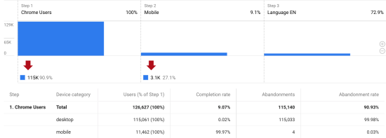
A funnel can contain up to 10 steps, whose sequence can be adjusted in time. Each step can be adapted to one’s individual needs and at the same time contain conditions. In funnel analysis, a data point is also a starting point for further analysis.
Funnel analyses can either be open or closed, meaning the previous step is optional or obligatory. In order to get an insight into the chronological sequence, the time spans between the steps can be visualized. This can be very beneficial if you want to comprehend the customer journey for a certain segment and optimize it in the following step. For example, you can use it to get to the root of the following question: How much time elapses between the first visit from an organic source and scrolling on a particular page? From this group, I can create a segment of desktop users and use them for further analysis.
Path Analysis in Google Analytics 4 Properties
This analysis area focuses on user flows. You might already be familiar with this report in its basic form from Universal Analytics. The Behavior Flow report can be found in standard reports under "Behavior" and offers only a limited amount of individualization. You can apply segments and change the primary dimension. Overall, however, the Behavior Flow report is rather poor in usability.
Google Analytics 4 Properties is fundamentally different due to its data model—tracking is event-based. This enables us to gain less user-based than event-based insights. In addition, several path analyses are possible simultaneously, which allows the same question to be approached from different perspectives.
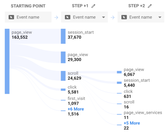
To start, you need to define either a starting point or ending point of the analysis. At this stage, three different dimensions are available for the steps: event name, page title and screen class, and page title and screen name. Other dimensions will certainly be added in the near future. To maintain an overview, the five most frequent events are shown as individual nodes. The remaining events are integrated into the step as an aggregated node. If you need to, you can collapse them. But of course, this can quickly become confusing.
The path analysis is an interactive diagram. The next step must be actively selected based on the shown nodes. After that, as with the first node, the five most frequent events are displayed.
Individual nodes can be excluded, and node types can be restricted. This allows the analysis to be even more focused. The feature to show only unique nodes skips identical, consecutive nodes. Moreover, this reduces complexity. A breakdown with a secondary dimension breaks up the nodes in itself and shows subsections when hovering the cursor over the node. Filters or a segment may also be added. For example, I can see how many pageviews exist from different countries and can break them down to a specific country with a scroll event. With these individualizations, the path analysis gains more depth.
Google Analytics 4 Properties Segment Overlap
The most exciting analysis for me is certainly the segment overlap. In this form, the report is completely new for users of the free Universal Analytics version. For them, only the Audience Overlap report for Google Signals was available. However, these had to be activated and did not include the same extensive features as the Segment Overlap technique. Until now, this report was only available for users of the paid 360 version of Google Analytics. In the area of Advanced Analysis, the segment overlap technique could already be used. As the name implies, this analysis mainly works with segments. Up to three segments can be utilized and refined with filters and breakdowns.
The interactive diagram provides information about the correlation between the selected segments. At the user or event level, the data selection is broken down in the table below. All combinations of the selected segments are shown, as well as the individual segments separately.
For example, overlaps between different groups of buyers can be evaluated. How do new customers in the DIY product category behave in comparison to existing customers? Are there any overlapping segments that could be particularly interesting for remarketing ads.
This is where the true strength of segment overlap becomes apparent: If you find an interesting data point, you can create an audience or another segment with a right-click. In the future, you will have to dig less deeply into your own data to find a specific sub-segment but can use the transparent segment overlap instead.
The Essentials to Go
The analysis area of Google Analytics 4 Properties offers numerous new analysis options. The interactive design invites you to try it out and provides you with reference points for further analysis. As is often the case with Google Analytics, the analyses only gain in importance when they are related to your own corporate goals and KPIs. Likewise, you learn the most through trying it out and getting comfortable with the new reports.
