Revolutionizing Web Design: How Figma Streamlines Full‑Cycle Workflows ‑ Part 1

In the web design world, collaboration is the linchpin of innovation. But what happens when silos form and teams drift apart?
At the outset of any project, establishing a solid foundation based on co-innovation and collaboration principles is crucial. It empowers teams to unleash their full potential, embarking on a journey to create transformative experiences. Bringing together stakeholders, designers, product owners, developers, and content creators in a process that encourages alignment and the exchange of ideas is essential. Developing a Figma-based design system that serves as a single source of truth—while remaining open and inclusive to the team's needs—nurtures this invaluable connection.
In this two-part series, we will delve into how harnessing Figma's distinctive set of tools and capabilities has emerged as our preferred method for bridging these connections and building superior digital experiences. Part One focuses on best practices for creating an efficient component library within Figma during the initial design stages. Part Two dives deeper into how Figma can support file organization and team workflows in the production stages.
In web design, common challenges arise when teams work in parallel without effective communication, encounter inconsistencies between library usage and specifications, face a lack of necessary information during handoff, and experience inefficiencies in design and development processes. Mitigating or avoiding these challenges requires the implementation of techniques and processes tailored to the unique requirements of the project and team.
Our solution harnesses Figma, a leading design platform, and its robust toolkit and collaborative features. Key features include auto-layout and component variables, facilitating the creation of scalable systems. Figma fosters collaboration by enabling all teams to work within a single file, enhancing version control and efficiency. While numerous tools and features are available, Figma’s features applied with best practices are the gold standard for building scalable systems. We’ve applied these principles for a Fortune 500 financial company that required a system that supported the largest of scale.
The following sections delve into key principles such as inclusivity, flexibility, scalability, and efficiency, highlighting the pivotal role of a well-constructed component library. This system facilitates teams in finding common ground, connecting expertise, and working in a more informed, organized, and efficient manner.
Identify Scale for Crafting A Practical System
To create a successful design system, it's critical to thoroughly understand the product, team, goals, budget, and stakeholders. There's no one-size-fits-all solution for design systems since each project and team has unique requirements. Understanding this scale will guide which tools and processes are appropriate.
Inclusive Team Design
The design system should cater to the diverse needs of all involved teams. It must prioritize inclusivity, accommodating varying levels of software familiarity. It should be intuitive, practical, and capable of supporting different team needs while also promoting collaboration.
Flexibility and Scalability
The system should be flexible and scalable to adapt swiftly to changing conditions. Continuous iteration is key for enhancing digital products as requirements, content, audiences, and technology evolve rapidly. Think about the needs of the component library over the next few years as it relates to the size of teams and libraries, and the frequency of iterations.
Efficiency is Key
The system should promote efficiency where it matters most. As the scale of needs increases, upfront time investment to build tools and processes will yield higher efficiencies.
Crafting Efficiency: Component Library Construction
In constructing a component library, our tool of choice is Figma, which plays a pivotal role in fulfilling these objectives. It provides a range of valuable features that help bridge the gap between tools, tasks, goals, and team members. Mastering these gold-standard techniques and processes not only enhances team clarity, it ensures efficient utilization of the system once it's implemented.
Component Libraries
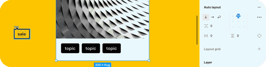
When constructing a design system, adopt a holistic approach by incorporating the principles of atomic design. This involves structuring systems from basic building blocks to progressively more complex elements. By utilizing this method, the solution, no matter its complexity, will have a solid core built upon fundamental building blocks. This interconnection between elements allows for consistency, cohesiveness, and the seamless implementation of changes and updates across components from foundational elements and to all instances within more complex components.
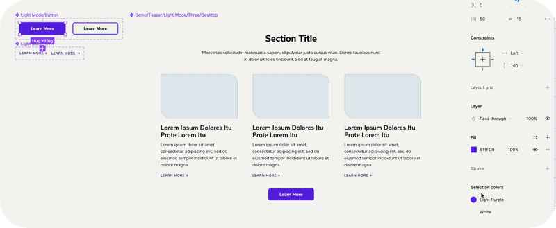
Figma facilitates the creation of scalable component libraries, mirroring CMS capabilities. The most common tools include Auto-Layout, Text Property, Boolean Property, Instant Property Swap, Variant Property, and Nested Component Property. Mastering these component-building techniques enhances team clarity, reducing ambiguity and documentation to simplify the implementation process and ensure consistency between design and development. It also ensures efficient utilization of the system once it's implemented.
The availability of user-friendly properties, styles, variables, and collections ensures that each component conveys its behavior, capabilities, and responsiveness across different breakpoints. Components adapt dynamically based on selections and seamlessly facilitate content editing and responsive layout design within components, enhancing clarity between teams and streamlining collaboration. Edits made in the connected library reflect across all instances in various files, saving time when global changes are needed.
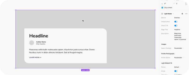
Interface Modes: Beyond Figma’s primary use for building designs, it also has prototype and dev modes which are all interconnected to provide essential information to every team involved.
Presentation/prototype mode: Enables quick prototypes for reviews and user testing. For presentations, we build slide components that can easily be edited so that the slides and prototype can all live within the same tool, and contextual documents side by side.
Dev mode: allows developers to inspect components and views of measurements. Comprehensive libraries enable developers to navigate through component sets and provide insights into how components work, their attributes, and any required overrides. This improves developer productivity and collaboration with designers.
A Collaborative Component Library is Critical to Success
The discussion in Part One spotlights Figma's role in creating scalable component libraries. The incorporation of Figma’s component tool properties ensures clarity between teams and streamlines collaboration, and sets the foundation for more efficient maintenance to the library. Figma's Interface Modes, encompassing prototype mode and dev mode, are positioned as valuable features that go beyond design construction. These modes enable quick prototypes and presentations and empower developers to inspect components, enhancing productivity and collaboration between design and development teams.
With the component library foundation established, Part Two will dive deeper into how Figma can support file organization and team workflows in the production stages.