Revolutionizing Web Design: How Figma Streamlines Full‑Cycle Workflows ‑ Part 2

Part One of this two-part series focused on best practices for creating an efficient component library within Figma during the initial design stages. It emphasized the need to identify the scale of the project, considering factors such as product specifics, team dynamics, goals, budget, and stakeholders.
Part Two dives deeper into how Figma can support organization, workflows, and production.
Crafting Efficiency: Organization and Workflow
When establishing the organization and workflow of the component library, consider how to clearly understand statuses within all phases, find the latest page designs, flow design iterations into the Component Library, hand off for Production, and keep Figma files in parity when decisions and functionality change during development. Organization and workflow can be critical so that everyone—from members of different teams or new team members—can easily find the latest files and know when enhancements will be available. The scale of your team, project, and component library should guide which methods to use.
Communication and Collaboration
Figma serves as an all-in-one hub for communication and collaboration. It allows team members to view each other's screens, engage in conversations, and provide comments. Figma's focus on collaboration makes it a unifying tool for bringing people together.
File Organization
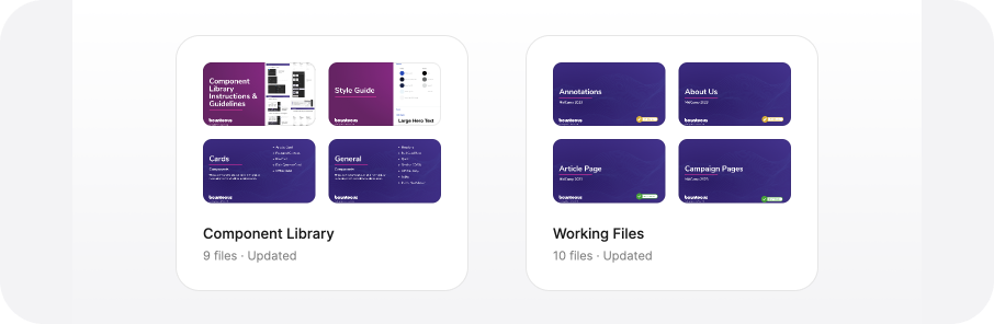
Figma Project: Placing Component Library and Working Files into separate projects ensures teams can easily find relevant files. You can also ensure team members have access to only relevant files by controlling permissions at this project level. Larger libraries can be further divided into Figma Files, organized by usage (such as global, cards, interactive, etc.). But for smaller libraries, components organized by these same categories within pages of a file are practical.
Figma Covers: Figma simplifies file organization by encouraging the use of covers. A pro tip is to include key information about file content and status so a user can view it at a glance. Files can be grouped intuitively, enabling team members to navigate project files and elements effortlessly. Covers can also include a flag with status for easy team clarity.
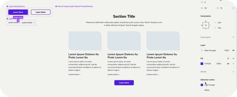
Figma Sections: Within files, canvases can be organized for more straightforward navigation using Figma Sections and labeling these sections as “Ready for dev” for a clearer understanding of status.
Figma Branch: A Fortune 500 financial client that releases new features each sprint had success using the branch feature. It permits safe exploration through file branches that, once approved, can be merged into the main file. Within the branches, the new components would be reviewed with dev during Agile Ceremonies and update files based on questions/concerns that came up. Product owners can link these files within dev tickets. A pro tip is to label each branch with the sprint number, release date and/or feature released for quick context.
Production and Maintenance
Building components that mirror the CMS allows quicker page design production by revealing both opportunities and limitations inherent in each component. This approach offers the added benefit of swift and seamless onboarding. Building components with a clear understanding of available features and facilitating easy updates ensures automatic alignment between design and production, minimizing roadblocks.
When Figma components are built from atomic principles, from foundational elements and growing into more complex entities, this allows for rapid global updates. For example, if you change the style of a button, that button will change across all instances in components. It allows for quick iterations and production, ultimately freeing time for more strategic efforts.
Production Handoff
Figma simplifies the delivery of files and resources for production, facilitating the process for designers. Developers can quickly inspect designs and access the information necessary to commence building.
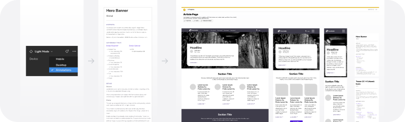
A pro tip is to include an annotation variant for each component, facilitating delivery with specific details about behavior, accessibility, functionality, and attributes, ensuring consistency of detail of annotations that can be tailored to individual project requirements. By creating annotations as a variant, you can easily place them next to the design for reviews and handoff. By creating each section with Auto Layout, the sections within the annotations can maintain padding and turn on/off sections for the audience. Clients that require multiple stakeholder reviews, each with different audiences, gained efficiencies by avoiding rewriting annotations to fit each audience’s needs.
Documentation and Guidelines
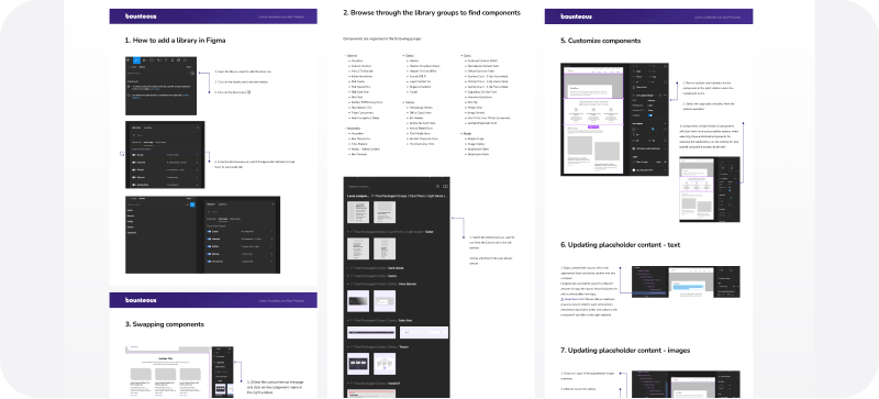
To maintain consistency as teams and products evolve, it's essential to create comprehensive documentation and guidelines. Establishing clear rules and guardrails ensures the consistent use of the system, with room for improvement and growth. It’s a great tool to help onboard new team members, particularly those less familiar with Figma.
A Collaborative System is Critical to Success
Every team possesses its unique challenges, goals, strengths, processes, and dynamics. Maintaining this as the central focus when constructing a collaborative system is paramount to its success. Establishing this foundational approach brings clarity and opens the doors to collaboration, whether you're involved in a new project or working on an existing product. However, the specific method for creating or updating this foundation will vary depending on the team and situation.
In our fast-paced world, where delivering purposeful experiences is vital for conveying value and relevance, the ability to adapt while preserving the essence is not merely an option, it’s a necessity. The initial time investment into your foundational workflows and design system guarantees adherence to the core principles of product design: consistency, relevance, and user-centered experiences. Additionally, the establishment of streamlined design systems and workflows empowers teams to devote themselves to more strategic efforts, nurturing creativity. This not only leads to happier and more empowered teams, but also contributes to the creation of a superior product that stands out in today's dynamic and competitive landscape.