Optimizing Your New Facebook Timeline
This past weekend, Timeline for Pages became the new standard for brand presences on the social network. Need help getting started? We have a post covering all of the basics that can get you off to the right start. Hopefully over the weekend you’ve gotten a chance to take a look at the new admin panel, play around with some of the features, and uploaded your first cover. Well, we’ve been tinkering with Timeline too, and we wanted to share some best practices with you for when you design your page.

The first question you should re-evaluate, before adding or changing a single feature, is what you want your Facebook presence to do for your company. Is it your storefront? A customer service tool? Or part of your larger marketing strategy? This basic decision about your primary focus will determine how you format a few different sections of your page. As we go, I’ll pull out key takeaways for each type of brand presence.
Designing Your Timeline – The Basics
The basic design of your page should be influenced by a few different things – your product or service, your overall design aesthetic both on and outside of Facebook, and your expectations of users visiting your page. As far as your design aesthetic goes, that’s pretty straightforward – match the palette and feel of your website and other social profiles to promote consistency and to assure users they’re in the right place. Your cover photo is the first place you can do that – select a branded image formatted to the 855 x 320 px size allowed by Facebook. Then, select a 180 x 180 px profile picture that succinctly and memorably expresses your brand, even when it’s shrunken down to 50 x 50 px – the size that it will display when your posts show up in your fans feed.
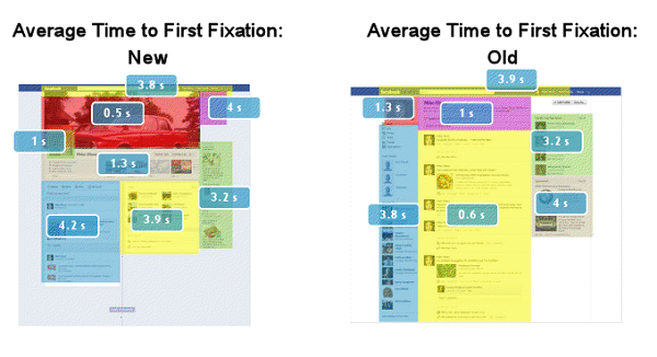
Now let’s talk a little about optimizing those features in conjuction with the rest of the controllable elements of your page. EyeTrackShop was commissioned by Mashable to do an eye-tracking study of where a page visitors eyes were drawn to when they viewed the new timeline format. The study used a new personal timeline, not a brand timeline, but since the UI is largely eactly the same we’re going to repurpose it as a guide for our usability recommendations.

Heat map produced by the study (Image Source: Mashable.com)

Order in which study participants inspected each element (Image Source: Mashable.com)
Time spent on each element (Image Source: Mashable.com)
Optimizing Your Cover
The first thing the eye tracking study concluded was that the cover photo, although the first thing the eye was drawn to, was given the least amount of love, just a half second of attention. This should shape how much ‘effort’ you put into the cover photo – aim for something that projects the best qualities of your brand and doesn’t distract with text; remember, a picture is worth 1,000 words. For LunaMetrics Timeline, we incorporated the sunrise banner we use on our blog, to keep the look and feel consistent and provide a welcoming image for our fans. This makes sense because it draws an immediate and strong connection to our blog and website, which is an integral part of our brand image. Here are some takeaways for each of the three focus types we listed above:
- Storefront – Highlight a new product or service, or a favored product. Nike currently is showcasing their new Fuel band – does your brand have an iconic or flagship product? Encourage users to submit photos using the product and use them to create a cover for some added engagement.

- Customer Service – Are you using a dedicated team of customer service representatives to handle your interactions? Do they sign their comments with their real names, like Amazon’s SM team? Use the cover as an introduction with headshots and names of your social representatives, for that extra personal touch.
- Marketing – Reflect your brands purpose, product, or past. Macy’s has a picture of their ‘World’s Largest Store’, Burberry chose a photo of their first storefront from 1857, and Red Bull chose a sponsored athlete in an action pose to highlight.

Just to make sure your banner is in compliance with Facebook’s new standards, make sure that you follow their recommended guidelines – covers cannot contain pricing or purchasing information, contact information, reference interface elements (like encouraging fans to ‘Share’ or ‘Like’ something), or calls to action. Additionally, from a usability standpoint, you’ll want to make sure your image is cropped to the 851 x 315 standard, in a sRGB JPG format, and less than 100 kilobites. This will ensure a quick loading time and the proper user experience – check here for the entire list of best practices for selecting your cover photo.
Optimizing Your Profile Picture
The next place that viewers will check out is the new, smaller profile picture. Make sure that your profile picture is as concise and conveys clearly that it’s your brand – outside of your timeline, it’s your representative ‘badge’ on fan feeds, and it will be shrunk to 50 x 50 px in that environment. Since most of your engagement with fans will happen in-feed, it’s very important to make sure this image is to the point. Because visiting users view the cover first, then this image, don’t try and incorporate it heavily into your cover, as it disrupts their ‘eyeflow’ and might subconsciously derail them. Something subtle, like Angry Birds cover image/profile picture combo, might be an extra value-add for visiting fans, but can hurt usability outside of the timeline.

Optimizing Your Apps
This brings us to the next stop users make, and the longest usable time they spend on your timeline – the apps bar. If you haven’t already, you should play around with the apps selection functionality. You’ll notice that you can’t change the image, name, or position of the Photos app, but you have a lot of choice outside of that. Your timeline can feature up to 12 apps, but users are not very likely to click and view your extra apps when they’re checking out your timeline, so optimize for the three that you do have control over. Additionally, you should have noticed by now that you no longer can set the default tab to like-gated content. More on that in a second. Here are some takeaways for what apps you should select in your timeline depending on your goals for your Facebook presence:
Storefront – Incorporate a catalog app – Express offers an interactive catalog of their styles and one-click access direct to their storefront. Can’t swing that? No problem – just hook your business in with a Pinterest plug-in directing users to a board featuring your products.

Customer Support – Have a direct line to your customer support team – Nike has a Nike+ Support app in their roster that leads to a ‘wall’ experience where they can publically field customer issues. In lieu of a customized customer service platform, a Twitter app provides the same end-user effect.

Marketing – Encourage users to subscribe to your newsletter, offer downloads and videos, or highlight other parts of your campaign like Old Spice has. We chose to highlight our available upcoming training, our Twitter presence, and our training videos.

This is the most interactive and engaging portion of the new timeline, according to the heat map, so view the suggestions bar as the best chance to convert for the primary your Facebook Timeline is there to do. Take this into consideration when selecting the display images of your apps – on our Timeline, our first choice is our ‘Sign up for training’ app, followed by our Twitter and YouTube plug-ins. We’ve chosen to create a shared background for the apps as an added design touch to help encourage eyeballs to stick around that part of our profile a little longer.

Viewer-Fan Interaction
The next part of the Timeline that viewers will focus on is the right column of the main body of the page. On personal Timeline pages, this space is devoted to Friends – similarly, on Brand Timelines you’ll see this section highlights interactions from friends of users who ‘Like’ your brand. The first segment lists friends of the viewer who also like the brand.

Following that is a segment showcasing brand mentions by friends of the viewer. More on this in a second.

And the final portion of this segment is ‘Recent Posts by Others on…’ which highlights posts that any fan writes on your brands Timeline.

Of the three sections, ‘Recent Posts By Others on…’ is the only portion you can disable. As part of our best practices, we would recommend removing it – although it can show engagement, this space is probably better used for brand-related content. The Friends who also like section is invaluable, since it provides a personal connection and motivation for the viewer to connect with your brand.
Note About the Friend Brand Mentions Section
The section that highlights brand mentions by friends of the viewer can be a little troublesome – it apparently does not have a sentiment algorithm dictating it’s choices and can highlight some strange mentions out of context, like this gem that greeted me on Coca-Cola’s page. Unfortunately, you cannot currently disable this feature.

The Best for Last
The final place your visitor will see in their initial viewing of your brand Timeline is the actual content you’re posting. Although not as controllable or customize-able as the Apps section, there is plenty of room to create engaging posts that help you convert visitors. As a rule of thumb, use pictures for this content whenever possible, since those offer the most engagement with users and can provide a catch to get people scrolling through your timeline. The ‘Pin’ feature can be helpful here to make sure that picture-based and engaging content is always the first thing that users get exposed to when visiting your brand.
On The Whole, Timeline Looks Promising
In a reassuring move to businesses concerned about their ability to engage with fans, the eye tracking study confirms that the friends interaction space and Timeline wall are where visitors spend the most time collectively, a promising result. Additionally, a few early studies show that pictures and video have been increasingly engaging with the new build and that businesses and brands stand to benefit a lot from the new layout. Bear in mind that, even with these new changes, most of your fan-brand interaction is going to occur within their news feed, not on-page on your Timeline, and as always, make sure you’re tracking your engagement and adjusting these best practices to what works best for you and your business.
Do you like the new Timeline? Let us know in the comments!


