Explore Customer Journey With Advanced Analysis In Google Analytics 360
If you’ve made it your personal (and professional) mission to map out your company’s Customer Journey from brand awareness to conversion, you’re not alone! In fact, this ever-evolving buzzword and analytical challenge has been one of the most talked about concepts in the office over the past few months – we simply can’t get enough!
Even with increasing publicity, the Customer Journey has remained elusive to many analysts and marketers alike due to limited out-of-the-box reporting options. Sure, BigQuery, R, Python, and other advanced analysis tools are fantastic ways to get after that GA data and transform it to your heart’s content (check out my colleague’s post on the topic). But isn’t there an easier way to at least begin the process? Cue Google’s response: Advanced Analysis was launched this May for Google Analytics 360 customers.
As you may know, Customer Journey can mean different things to different people. Today, let’s focus on the user’s website/acquisition journey.
What Is Advanced Analysis?
In addition to the standard Google Analytics reporting interface, Advanced Analysis offers multiple mechanisms for deeper, sophisticated exploration of data. You can think of the tool as a cross between Data Studio, which is used primarily as a reporting and visualization platform, and the Google Analytics custom reporting feature, which has typically been used for ad-hoc analysis purposes.
Our focus for the remainder of this discussion will surround the awesome problem-solving features of Advanced Analysis as they relate to the Customer Journey. To learn more about navigating the individual reports than what I covered above, check out Google’s introduction to the tool here.

To get you started in your Customer Journey analysis, the Advanced Analysis dashboard comes with three pre-defined templates – Exploration, Segment Overlap, and Funnel Analysis, as well as the option for complete ad-hoc analysis.
Exploration
What makes the Exploration report truly exciting is the expanded scope of analysis. Unlike in traditional Google Analytics reports, the Exploration report interface is powerful enough to handle up to five dimensions and 10 metrics (values) per report. There’s even a “Columns” feature which makes the report resemble a detailed pivot table.
Moreover, the Exploration report goes beyond traditional pivot table analysis by providing visualization opportunities too, such as pie chart, line chart, bar chart, plain text, or even heat map visualizations (shown in the screenshot below). For example, now you can quickly visualize which source(s) and medium(s) result in the most transactions, export the data to Google Sheets with the touch of a button, or share the link with your fellow marketers.
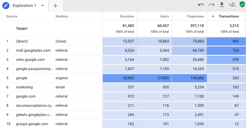
Using this data, we might notice that referrals are treating us very well – specifically from googleplex.com. But how do we take action on this observation? Advanced Analysis has you covered yet again. By right-clicking on the row with “mall.googleplex.com,” we can create a segment from the selection, or even build an audience to remarket to from the data.
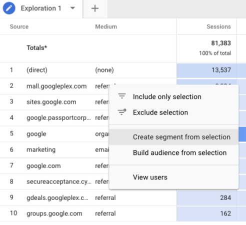
This feature actually extends past the exploration report – you can create segments or audiences within the entire Advanced Analysis suite of reports. Once that special segment has been identified, you can also publish the segment to Google Analytics for use across all of your platforms, including Data Studio. Additionally, these audiences can be published to Google AdWords or Display & Video 360 for remarketing or ad targeting. Finally, clicking the “View Users” option from the menu will open the user explorer report in Google Analytics, giving you the ability to drill down on the segment and identify key trends for users who converted, and especially those who did not.
One more note about Advanced Analysis (which spans all of the report types we will talk about) – by clicking on the “+” sign next to your current tab, you can create a new Exploration, Funnel, or Segment Overlap report to analyze your data side by side. The sticky navigation pane to the left will remain with you throughout the entire project!
How does this relate to the Customer Journey, you ask? These segments become increasingly useful in the preliminary stages of mapping our customer’s touchpoints. We know that each user takes a different path prior to conversion, but to wrap our arms around the massive number of entries and exits, we often need to categorize users into personas, segments, or types. Once we’ve segmented users, we can often uncover similarities and differences that are actionable from a marketing and web dev perspective.
Segment Overlap
Just like we saw with the Exploration report, the Segment Overlap tool goes above and beyond what we’ve historically been able to visualize in Google Analytics. This tool will be particularly useful once you’ve created new segments using the Exploration report, the Funnel report feature, or segments within Google Analytics.
To quickly create a new Segment Overlap report from the page that you are on, navigate to the “+” sign next to your current tab. From there, you can create a new Exploration, Funnel, or Segment Overlap report to analyze your data side by side. The sticky navigation pane to the left will remain with you throughout the entire project!
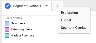
Let’s use the Source/Medium example from our Exploration report (Source = mall.googleplex.com AND Medium = referral), and compare the segment with our other top transaction segments (Direct/None) and (sites.google.com/referral). By creating these segments within our Exploration report, Advanced Analysis places the segment in the left-hand variables column. All we have to do is drag and drop into a new Segment Overlap report.
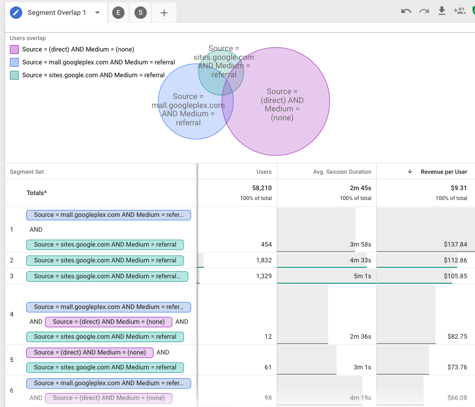
Let’s do some analysis – what interesting details can we glean from this report? One of the first observations is that while Direct traffic seems to represent the majority of transactions, the revenue per user is actually much higher for our referral sources.
Did we run a display campaign via sites.google.com in the past that is resulting in increased purchases this month from website referrals? Perhaps referral users are becoming repeat purchasers, bumping up the ROI for our previous marketing efforts. If we didn’t run a display advertisement, maybe we should consider it, as this channel seems to provide a significant revenue opportunity!
There are many uses for the Segment Overlap report. One of the most notable ways of using this new feature includes looking at behavior or customer-focused segments to understand how your remarketing audiences may overlap. This is the first time that this kind of data has been made available to end users, so get creative! For example, you may ask yourself “What is the overlap between the “Blog Readers” segment and the “Add to Cart” segment? You may notice that exploring the commonalities and differences between segments will help your organization group behaviors and better understand the types of consumers that are visiting your site.
Additionally, be sure to check out the breakdowns and filters components of Advanced Analytics, which enable even further segmentation for slicing and dicing that data.
Funnel Analysis
Drumroll, please! It’s time for the feature we’ve all been waiting for – the Funnel Analysis reporting tool! Once we’ve explored our data, created a few segments, and analyzed our populations within the Exploration and Segment Overlap report, we may have a better idea of the starting and ending points of our Customer Journey. Getting to the hazy details during the middle of our customer’s session is where difficulty often sets in. The Funnel Analysis report is primed and ready to help you better understand customer drop-off and customer conversion, from any starting or ending point you choose.
Let’s take a look at our three top (Source / Medium) performers within the Funnel report to see where we lose some of our customers. We’ll start with a checkout process funnel, and then we can segment further.
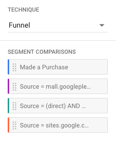
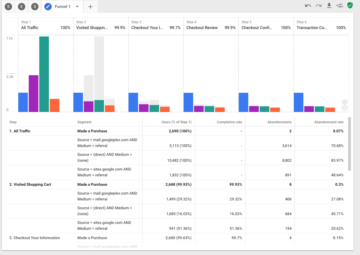
In the Funnel report, we can see that we have a pretty great retention rate throughout from viewing a shopping cart to completing the checkout process. However, it seems as if we lose a significant amount of customers between these steps for certain segments, so let’s create a second funnel to explore. Also, notice that we have 6 steps in our funnel! Advanced Analysis is configured for up to 10 funnel steps (that’s double the standard 5 in Google Analytics)!
Let’s look specifically at Men’s Clothing to see if we can find a trend. Here, we’ve created a funnel step for Men’s Apparel, Men’s T-shirts, and shopping completions. We also swap out T-shirts for Hoodies to see if our trend is valid across products.


We can see that drop-off occurs at the Men’s Apparel landing page for many of our customers, regardless of T-shirt or Hoodie selection, and regardless of referral channel. Therefore, we may want to explore the journey around Men’s Apparel to see if we can improve the experience for our customers, resulting in additional transactions.
Moreover, since we know these referral users tend to result in repeat customers (bringing in revenue for the company,) we may decide to remarket to those who have viewed the men’s apparel page but did not convert. If you use Optimize 360, you may decide to run experiments to see if you can improve the likelihood of purchase.
Note: If it’s challenging to view the bars due to size discrepancies, simply scroll your mouse or click on the “+” sign to the right of the chart. This will create “breaks” in the outliers for an easier viewing experience, as shown above.
Back to the Customer Journey
Using the funnel tool, we could continue to create subsegments using the right click method discussed earlier. These additional segmentation opportunities would bring us closer to understanding personas and buyer types site-wide. We can also use the completion rate & abandonment rates beneath the Funnel reports to observe details about the completion and abandonment rates between each step, informing our marketing and sales positions.
Setting up robust goals in Google Analytics will also help you to arrive at the underlying revenue-generating activities for your website. Often times, the Goal Funnel reports within GA are a great way to begin the Customer Journey process. Another bonus? You can use goals within your Advanced Analysis funnels!
It is important to note that identifying journeys & funnels that you will want to use as recurring reports will most likely take some time and experimentation. Users often flip-flop between tabs, content types, and even product types before completing a transaction.
Therefore, setting realistic expectations up front about the level of detail you need to make sound business decisions is paramount. Often times, understanding the general direction of activity is all you need to start making better website design and digital marketing decisions.
A Quick Recap
While Advanced Analysis may not be a replacement for tools of the trade like Data Studio or BigQuery (Data Studio offers corporate branding/style opportunities, calculated metrics, custom date ranges, and permissions access, which are limitations within Advanced Analysis), chances are you will find the segmentation capabilities and funnel reports useful within your organization. And, most importantly, these tools are one way to get another stride closer to that elusive Customer Journey.
Find another cool feature of Advanced Analysis? Let us know in the comments below!


